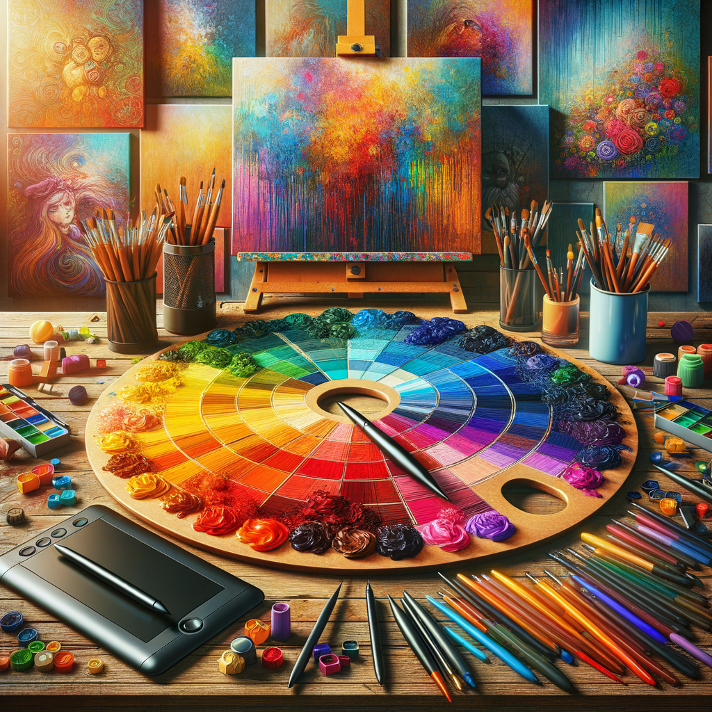
Color plays a crucial role in digital artwork, influencing mood, tone, and the overall impact of your piece. For artists, knowing how to choose a harmonious color palette can make all the difference in creating visually stunning art. In this article, we will dive deep into color theory, offering practical tips and techniques that will help you master the art of color selection for your digital creations. Whether you are a beginner looking to grasp the basics or a seasoned artist aiming to refine your skills, this guide is here to help you enhance your artwork through the power of color.
Understanding color theory is essential for any artist who wants to create compelling and visually engaging artwork. The way colors interact can evoke emotions, set the atmosphere, and even guide the viewer's eye through the composition. In this section, we will explore some fundamental concepts of color theory.
The Color Wheel
The color wheel is a visual representation of colors arranged based on their chromatic relationship. It consists of primary, secondary, and tertiary colors. Understanding the color wheel will help you recognize how colors relate to one another and how you can mix them effectively.
Primary Colors
The primary colors are red, blue, and yellow. These colors cannot be created by mixing other colors and serve as the foundation for creating other colors.
Secondary Colors
When you mix primary colors, you get secondary colors: orange (red + yellow), green (blue + yellow), and purple (red + blue).
Tertiary Colors
Tertiary colors are formed by mixing primary and secondary colors, such as yellow-orange or blue-green. Understanding these relationships can greatly enhance your ability to select a color palette effectively.
Color Harmony
Color harmony refers to the aesthetically pleasing arrangement of colors. Here are some common color harmony schemes:
- Complementary: Colors that are opposite each other on the color wheel, such as blue and orange, create a vibrant contrast.
- Analogous: Colors that are next to each other on the color wheel, such as yellow, yellow-orange, and orange, provide a harmonious look.
- Triadic: A color scheme that consists of three colors evenly spaced around the color wheel, like red, yellow, and blue for a balanced, vibrant palette.
Choosing Your Color Palette
When choosing a color palette, consider the emotions you want to evoke and the message you wish to convey through your artwork. A monochromatic palette, consisting of different shades of one color, can create a sense of harmony and cohesion. In contrast, using contrasting colors can evoke a sense of excitement or drama.
Practical Tips for Selecting Colors
- Use Tools: There are several digital color tools available, such as Adobe Color and Coolors, that can help you create and explore different color palettes.
- Look for Inspiration: Take cues from nature, existing artworks, and photographs. Pay attention to color combinations that catch your eye.
- Limit Your Palette: While it's tempting to use many colors, limiting yourself to a few can create unity and focus within your artwork.
- Test Before Commitment: Always test your chosen colors on small areas before applying them to your main piece to see how they work together.
Creating with Color
Once you have a color palette, it's time to start creating. Here are some techniques to help you apply your colors effectively in your digital art:
- Layering Colors: Build depth and dimension by layering different shades and tints of your palette.
- Blending Techniques: Use blending modes and opacity settings to create various effects, from soft transitions to bold contrasts.
- Lighting Effects: Consider the light source in your artwork and how it affects the colors. Highlights and shadows can dramatically change the perception of your colors.
Final Thoughts
Mastering color is a continuous journey for any artist. As you experiment and practice, you'll develop a keen understanding of how colors work together, allowing you to create more captivating digital artwork. Don't hesitate to explore, make mistakes, and learn from them. The more you engage with color, the more confidently you'll express your artistic vision.
By understanding the science and emotion behind color choices, you can elevate your digital artwork to new heights. Perfecting your color palette is not just about aesthetics; it’s about conveying feelings, stories, and experiences through your art. Embrace the power of color in your creative journey.

