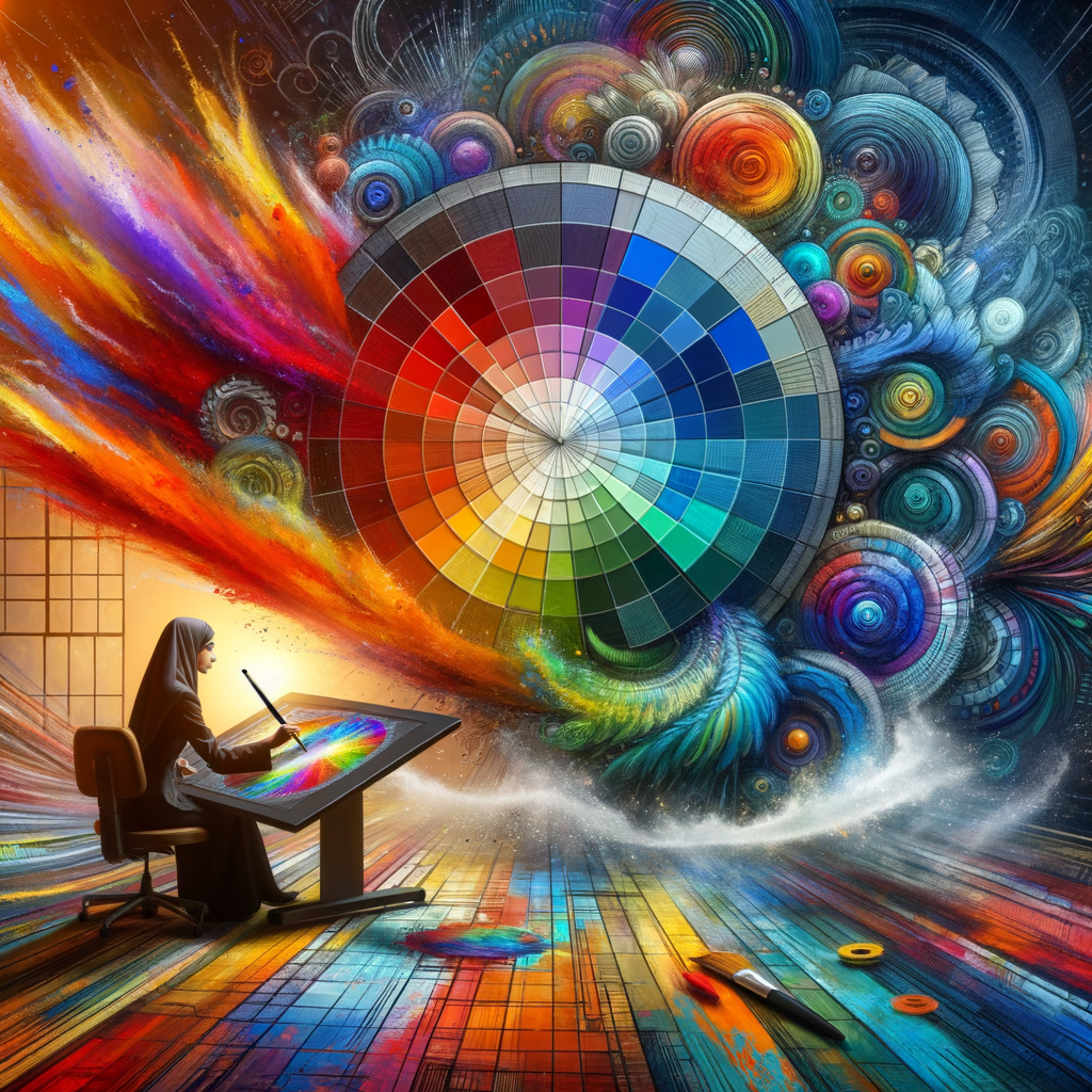
Color is one of the most powerful tools in digital art. Understanding color theory can dramatically improve your artwork, helping you create compositions that are both visually striking and emotionally resonant. In this article, we will explore the principles of color theory, the role colors play in art, and practical tips to enhance your color palette. Whether you're a beginner or an experienced artist, mastering color will elevate your work to new heights.
Color theory is a comprehensive guide to understanding how colors interact, complement, and contrast each other. It helps artists make informed choices when selecting colors for their artwork, leading to harmonious, engaging creations. Here, we will delve into the fundamentals of color theory, exploring the color wheel, primary, secondary, and tertiary colors, as well as the psychological effects of color in digital art.
To begin, let’s look at the color wheel, which serves as a fundamental tool for artists. The color wheel consists of primary colors (red, blue, yellow) that can be combined to create secondary colors (green, orange, purple) and more complex tertiary colors. When choosing colors for your digital paintings, it’s essential to understand how these different categories work together.
Color harmony is a crucial aspect of effective design. There are several color schemes that artists can use to create visual interest and cohesive works of art. Some popular schemes include:
- Complementary Colors: These are colors located directly opposite each other on the color wheel. Using complementary colors creates a vivid contrast that draws attention, making them ideal for focal points in your artwork.
- Analogous Colors: These colors are adjacent to one another on the color wheel. By using analogous colors, you can create a more serene, harmonious feel in your compositions.
- Triadic Colors: A triadic color scheme involves three colors that are evenly spaced around the color wheel. This creates vibrant palettes that can be very engaging to the viewer.
Now that you understand color harmony, it’s time to explore the emotional impact of color in art. Each color can evoke different feelings and associations. For example, blue often conveys calmness and serenity, while red can signify passion and excitement. Knowing the emotional responses your chosen colors can elicit will help you convey your intended message more effectively through your artwork.
When working digitally, selecting a color palette is essential to your artistic process. Here are some practical tips for creating a successful color palette:
- Limit Your Palette: Don’t overwhelm your viewers with too many colors. Stick to a limited palette, ideally between 3-5 main colors, to create a strong visual impact.
- Explore Color Swatches: Utilize color swatches and references from existing artworks. Analyze pieces that appeal to you and understand how artists balance colors.
- Experiment with Shades and Tints: Don’t be afraid to adjust the brightness or darkness of your colors by adding white or black. This can add depth and variety to your work.
To illustrate these concepts, let’s walk through a step-by-step process on how to design a digital artwork while applying color theory:
- Choose Your Subject: Start by selecting a subject for your artwork. This could be a character, landscape, or abstract concept.
- Research and Gather Inspiration: Look for color palettes that resonate with your subject. Use platforms like Pinterest or Adobe Color to collect ideas.
- Create a Rough Sketch: Before diving into the coloring process, create a rough sketch to determine where the key elements will be placed within your composition.
- Select Your Color Palette: Based on your research, choose 3-5 colors and create swatches that you will use throughout your artwork.
- Start Coloring: Begin the coloring process. Remember to apply your understanding of color harmony and emotional impact as you paint.
- Refine and Adjust: Often, the first color choice isn’t perfect. Be willing to adjust your colors, experimenting with different shades and tints until you achieve the desired effect.
Another aspect of color theory to consider is the role of light in color perception. Light can drastically affect how colors appear—an object may look different under natural light compared to artificial light. When creating digital art, remember to think about the light source in your scenes, as it will influence the overall color temperature and mood of your work.
In addition to individual colors, patterns and textures can also enhance your color application. By incorporating textured brushes or layering techniques in your digital art, you can create depth and dynamism that invites the viewer’s eye to explore further.
Many successful digital artists make use of tools within software programs, such as Photoshop or Procreate, to enhance their understanding and application of color theory. Utilize features like clipping masks, blending modes, and opacity adjustments to create unique effects and combine colors in interesting ways.
As you continue to develop your skills, remember that experimentation is key. Don’t be afraid to play with colors, techniques, and styles. Each piece you create is an opportunity to deepen your understanding of color theory and how it can elevate your art.
In conclusion, mastering color theory is a fundamental skill every artist should strive to develop. By understanding the color wheel, color harmony, and emotional responses to color, you can create artwork that resonates with viewers on a deeper level. Whether you’re interested in creating beautiful landscapes, intricate characters, or abstract pieces, the principles of color and practical tips outlined in this article will guide you on your artistic journey. Happy painting!

