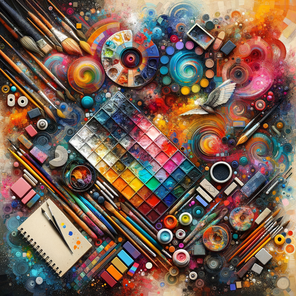
Understanding color theory and its application in digital art is crucial for artists looking to enhance their skillset. In this guide, we will delve deep into the nuances of color, how to effectively use color palettes, and tips on how to evoke emotions through your artwork. This comprehensive resource is designed for artists at all levels, from beginners to professionals, offering practical advice and insights for improving your art with the power of color.
Color plays a fundamental role in digital art, influencing how viewers perceive and interact with an artwork. Different colors evoke different feelings and responses; understanding these qualities can greatly assist artists in conveying their intended message. In this section, we will explore basic color theory, covering the color wheel, color harmony, and the psychology of color.
The color wheel is a circular diagram that represents the relationships between colors. It is divided into primary, secondary, and tertiary colors. Primary colors (red, blue, yellow) can be mixed to create secondary colors (green, orange, purple), which in turn can be combined to form tertiary colors. Understanding this hierarchy of colors is essential for making informed color choices in your artwork.
Next, let’s discuss color harmony, which refers to the aesthetically pleasing arrangement of colors. There are several schemes to achieve harmony:
- Complementary colors: Colors that are opposite each other on the color wheel (e.g., blue and orange) create vibrant contrasts when used together.
- Analogous colors: These are colors that are next to each other on the wheel (e.g., blue, blue-green, green) and create a harmonious combination.
- Triadic colors: Using three evenly spaced colors on the wheel (e.g., red, blue, yellow) can create a vibrant palette that is still balanced.
Understanding how to combine colors effectively is a skill that improves with practice. A great way to experiment with color schemes is by using digital painting software that allows for easy adjustments and experimentation.
Now let's explore color psychology—how different colors elicit specific emotional responses. For instance:
- Red: Often associated with passion, energy, and urgency.
- Blue: Typically conveys calmness, trust, and stability.
- Yellow: Represents happiness, optimism, and creativity.
Utilizing this knowledge can help artists not only appeal to their audience but also convey deeper meanings in their artwork.
Having established a foundation in color theory and psychology, let’s delve into practical techniques for selecting and using color palettes effectively. A powerful tool for any artist is the use of a limited color palette. Limiting your palette to a few colors can create a cohesive look while encouraging creativity within constraints. Many artists find success by choosing a dominant color and then selecting one or two accent colors.
There are also various online tools available for creating color palettes, such as Adobe Color or Coolors.co, which can assist artists in selecting harmonious colors quickly.
Another essential aspect of working with color is understanding value and saturation. Value refers to how light or dark a color is, whereas saturation describes the intensity or purity of a color. Two colors of the same hue can look entirely different depending on their value and saturation levels. Understanding and manipulating these elements can drastically enhance your digital artwork.
Moreover, lighting significantly affects how colors are perceived in a scene. When creating artwork, it's essential to consider not just the colors you choose but how light interacts with them. This includes understanding warm and cool light sources and how they shift the appearance of colors in your artwork.
Next, let’s look at practical exercises to improve your color skills:
- Color Mixing: Spend time mixing colors in your chosen software, trying to match colors from photos or existing artworks.
- Value Studies: Create grayscale versions of your work to focus on value rather than color.
- Palette Creation: Develop various palettes based on different themes or emotions and challenge yourself to create artwork using them.
In addition to exercises, don't forget the importance of studying the works of other artists. Analyze how they use color and consider how you might apply similar techniques to your practice. This could involve recreating pieces to understand their color choices or simply observing how different artists approach color in their creations.
As you continue to develop your understanding of color, always remember that experimentation is key. Don’t be afraid to try bold or unconventional color choices; the digital medium allows for unlimited revisions, making it an ideal space for exploration.
To sum up, mastering color in digital art involves a deep understanding of theories, practical application, and constant experimentation. By combining knowledge of color theory, psychology, and practical painting techniques, each artist can develop a unique and effective approach to color in their digital artworks. Embrace the journey of discovering color, and let it propel your artworks to new expressive heights.

