
Color is one of the most powerful tools in an artist's arsenal, especially for digital artists. Understanding color theory is crucial not only for creating stunning compositions but also for conveying emotions and narratives through art. In this article, we will delve deep into color theory, covering its fundamental principles, practical applications, and tips for selecting the perfect color palettes that resonate with your artistic voice.
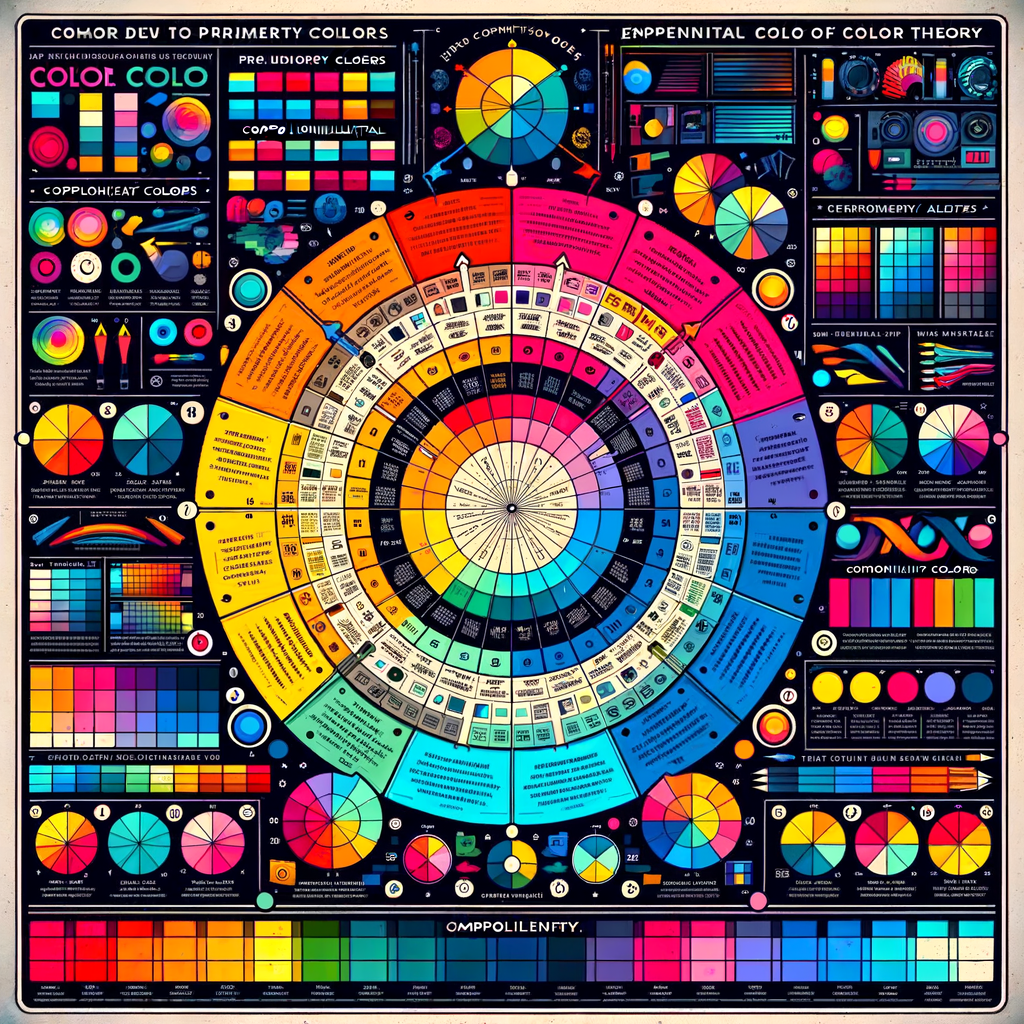
Color theory is a systematic approach to understanding the color spectrum and how colors interact with one another. At its core, color theory revolves around the color wheel, which categorizes colors into primary, secondary, and tertiary hues. By mastering color theory, you can elevate your artwork and communicate more effectively with your audience.
To start, let’s explore the three primary colors: red, blue, and yellow. These colors cannot be created by mixing other colors. Instead, they serve as the foundation for creating other colors. When combined, they produce secondary colors: green, orange, and purple. Tertiary colors arise when a primary color is mixed with a secondary color, resulting in hues like red-orange and blue-green.
Understanding the relationships between colors is essential for effective composition. Colors can be categorized as warm or cool. Warm colors, such as red, orange, and yellow, often evoke feelings of excitement and energy. In contrast, cool colors like blue, green, and purple tend to create a sense of calmness and tranquility. By carefully selecting warm and cool colors, you can influence the mood of your artwork.
Another essential aspect of color theory is the concept of complementary colors. These are pairs of colors found directly opposite each other on the color wheel. For example, red and green, blue and orange, or yellow and purple. Using complementary colors in your artwork can create a vibrant contrast, making the colors appear more dynamic and lively. Additionally, complementary hues can draw attention to key areas in your composition, guiding the viewer’s eye where you want it to go.
Analogous colors, on the other hand, are groups of three colors that are next to each other on the wheel. For example, blue, blue-green, and green are analogous colors. When used together, they create a serene and cohesive look in your artwork. These color combinations can be particularly effective in landscape paintings or scenes depicting nature.
Incorporating harmony in color usage is another important principle. An artwork that employs harmonious colors feels balanced and pleasing to the eye. You can achieve this by using a limited color palette or sticking closely to colors that share similar tones.
To illustrate the significance of color theory in digital artwork, consider how various artists use color creatively. Renowned artist Piet Mondrian, for instance, employed primary colors in his abstract works to create strong visual impact. The bold colors stood out against a neutral background, emphasizing geometric forms and lines in a compelling way.
When selecting a color palette for your digital artwork, consider establishing a color scheme that aligns with the emotions you wish to convey. A monochromatic scheme, which utilizes different shades of a single color, can produce a unified and subtle effect. In contrast, a triadic scheme that involves using three evenly spaced colors on the color wheel can create a more vibrant and energetic aesthetic.
Additionally, understanding color mixing is vital when working digitally. Most digital painting programs, such as Adobe Photoshop and Procreate, offer a variety of blending options for colors. Explore these tools to discover how different brushes and settings can influence the final appearance of your chosen palette.
As you develop your skills in color theory, don’t shy away from experimenting. Try unconventional combinations to see what resonates with your artistic style. The beauty of digital art is the freedom to explore and adapt colors effortlessly, so use this to your advantage.
In summary, mastering color theory will not only enhance your technical skills as a digital artist but also allow you to express your creative vision more effectively. As you explore the vast world of colors, remember to keep practicing and experimenting until you find the perfect balance that works for you.