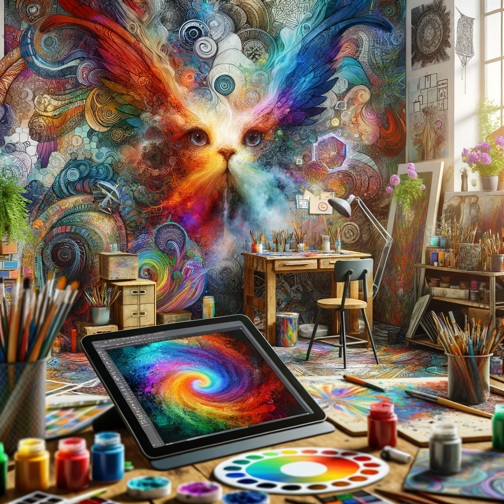
Color is one of the most powerful tools in an artist's toolkit, and understanding its theory is crucial for creating visually stunning digital artworks. This comprehensive guide will take you through the fundamentals of color theory, how to choose the right color palettes, and tips on mixing colors effectively to enhance your digital paintings. Whether you're a beginner artist or a seasoned professional, mastering color theory can elevate your artwork.
In the world of digital art, color can convey emotions, create depth, and set the mood of a piece. However, many aspiring artists struggle with color selection and mixing, often feeling overwhelmed by the vast array of options available in digital painting software. This article aims to demystify color theory and offer practical guidelines for its application in your art.
Understanding the Color Wheel
The color wheel is a visual representation of colors arranged according to their chromatic relationships. It is a fundamental tool for artists, as it helps in understanding how colors work together. The wheel is divided into primary, secondary, and tertiary colors.
- Primary Colors: Red, blue, and yellow are the primary colors. They cannot be created by mixing other colors.
- Secondary Colors: Green, orange, and purple are created by mixing two primary colors together.
- Tertiary Colors: These are formed by mixing a primary color with a secondary color, resulting in hues like red-orange or blue-green.
Familiarity with the color wheel helps artists understand color relationships, such as complementary, analogous, and triadic schemes.
Complementary Colors
Complementary colors are located opposite each other on the color wheel. For example, red and green or blue and orange. These color pairs create a strong contrast when used together, making each color appear more vibrant.
Using complementary colors can help create dynamic compositions and focal points within your artwork.
Analogous Colors
Analogous colors are next to each other on the color wheel, such as yellow, yellow-orange, and orange. They typically match well and create serene and comfortable designs. Artists often use analogous colors to create harmony in their artworks.
Triadic Colors
Triadic colors are evenly spaced around the color wheel and include three colors, such as red, yellow, and blue. This combination offers strong visual contrast while maintaining balance and harmony. Utilizing triadic schemes can add variety and excitement to your palette.
Selecting the Right Color Palette
Choosing a color palette is perhaps one of the most challenging tasks for artists. Here are some tips:
- Start with a limited palette of 3-5 colors to maintain harmony and cohesiveness.
- Consider the mood you wish to convey - warm colors often evoke feelings of excitement and warmth, while cool colors may give a sense of calm or serenity.
- Use color theory to guide your selections, such as combining complementary or analogous colors.
- Look at reference images and analyze their color schemes to gain inspiration.
Practical Exercises for Color Mixing
Practicing color mixing is essential for digital artists. Here are some exercises to improve your skills:
- Color Swatches: Create swatches by mixing different colors directly in your digital software. Note the results and keep a record for future reference.
- Color Matching: Take a reference photo and try to match the colors as closely as possible by mixing them in your digital painting software.
- Palette Challenge: Create artworks using limited color palettes, focusing on how to create depth and interest with fewer colors.
Common Mistakes in Color Selection
Many artists, especially beginners, make several common mistakes when it comes to color selection:
- Choosing too many colors, leading to a chaotic appearance.
- Using overly saturated colors that can be visually overwhelming.
- Forgetting to consider the background, which can significantly affect the perception of colors.
By being aware of these mistakes and actively working to correct them, you can develop a more sophisticated understanding of color.
Conclusion
Mastering color theory is an ongoing journey for every digital artist. By understanding the relationships between colors, practicing with different palettes, and learning from both successes and mistakes, you can enhance your artistic abilities and achieve stunning results in your digital artworks. So grab your digital tablet, experiment with colors, and let your creativity flourish!

