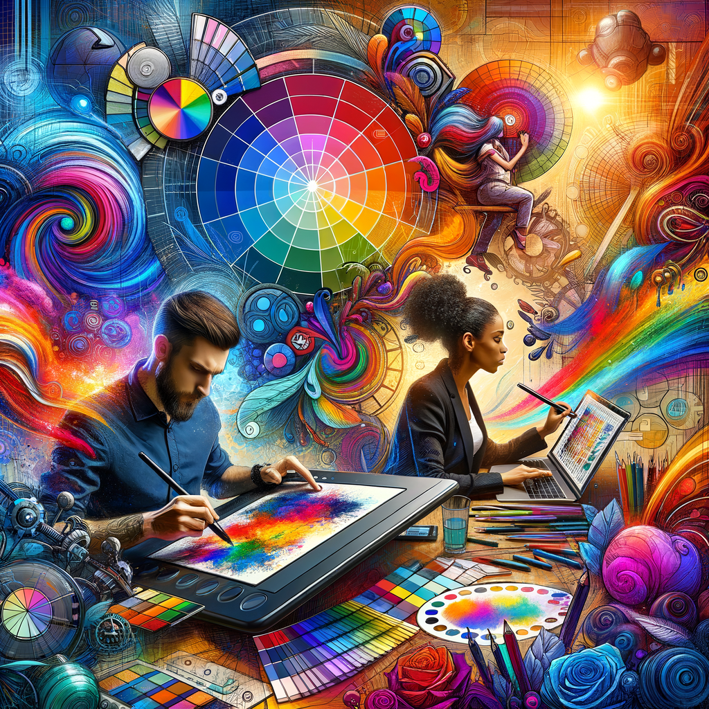
Color is one of the most powerful tools at an artist's disposal. Understanding color theory can greatly enhance your digital artwork, allowing you to convey emotions, create depth, and capture attention. In this article, we will explore the fundamentals of color theory, practical applications for digital artists, and tips for creating harmonious color palettes that elevate your compositions to new heights. Whether you’re a beginner looking to get started or a seasoned artist seeking to refine your skills, this guide will provide valuable insights to help you master color theory in your digital art practice.
Color theory is the study of how colors interact, complement, and contrast with each other. It is a foundational aspect of art that helps artists make informed choices about the colors they use in their work. Understanding color theory enables artists to manipulate emotions and guide viewers’ experiences through their art. Here, we delve into the fundamental concepts of color theory that every digital artist should know.
1. The Color Wheel
The color wheel is a visual representation of colors arranged according to their chromatic relationship. It consists of primary, secondary, and tertiary colors:
- Primary Colors: Red, Yellow, Blue. These are colors that cannot be created by mixing other colors.
- Secondary Colors: Green, Orange, Purple. These colors are made by mixing equal parts of two primary colors.
- Tertiary Colors: The result of mixing a primary color with a neighboring secondary color, leading to colors like red-orange and blue-green.
Familiarity with the color wheel allows artists to predict how different colors will interact with each other. For instance, complementary colors (colors opposite each other on the wheel) create a strong contrast that can help certain elements of your work stand out.
2. Color Harmony
Color harmony refers to the aesthetic balance achieved when colors are used together. There are several color harmony schemes artists can use:
- Complementary Colors: As mentioned, these colors are opposite each other on the color wheel, such as blue and orange, and create a high contrast.
- Analogous Colors: These are colors that are next to each other on the wheel, like blue, blue-green, and green. They create serene and comfortable designs.
- Triadic Colors: This scheme involves three colors that are evenly spaced around the color wheel, offering a balanced yet vibrant combination.
By experimenting with different color harmonies, artists can evoke different feelings and visual effects in their artwork.
3. The Psychology of Color
Colors have psychological effects that can influence how viewers perceive a piece of art. Here’s a brief overview of how different colors are generally interpreted:
- Red: Passionate and intense, often associated with love and anger.
- Blue: Calm and serene, usually conveys tranquility and stability.
- Yellow: Bright and cheerful, often linked to happiness and optimism.
- Green: Represents nature and growth, often associated with renewal.
- Purple: Known for royalty and luxury, can also represent mysticism.
- Black: Functions as elegant or tragic; it can signify power or mourning.
Applying the right colors can enhance the emotional impact of your artwork, making your pieces more engaging for viewers.
4. Color Mixing Techniques
Knowing how to mix colors effectively is crucial for digital artists. There are various mixing methods:
- Additive Color Mixing: Used in digital art, this involves mixing light colors, such as RGB (Red, Green, Blue). The more colors mixed, the lighter the result.
- Subtractive Color Mixing: This is used in traditional painting, where colors are mixed from pigments (like CMYK - Cyan, Magenta, Yellow, Black). Here, mixing colors usually yields a darker result.
Understanding these methods helps artists predict the outcome of their color choices when working on digital canvases.
5. Creating Your Color Palette
Creating a cohesive and effective color palette is essential in digital art. Here are steps to curate your own:
- Start with a Base Color: Choose a dominant color that reflects the mood of your artwork.
- Find Complementary Colors: Select colors from opposite sides of the color wheel that enhance your base color.
- Incorporate Analogous Colors: Adding colors adjacent to your base color on the wheel can create depth and harmony.
- Consider Neutrals: Do not forget to integrate neutral colors like grays or browns to provide balance.
Utilizing online tools like Adobe Color or Coolors can make palette creation more accessible and inspire innovation.
6. Experimentation and Practice
The best way to master color theory is through practice. Here are some exercises:
- Explore Different Palettes: Create artwork using different color palettes, from monochromatic to complementary, to see their effects on your work.
- Study Other Artists: Analyze the color schemes used in works by artists you admire and attempt to emulate their palettes in your own creations.
- Color Mixing Exercises: Spend time simply mixing colors in your digital art software to understand how certain combinations work together.
Taking the time to experiment and refine your understanding of color will undoubtedly elevate your artistic skill.
Conclusion
Mastering color theory is a journey that requires exploration and practice. By understanding the principles that govern color, you can create more compelling and emotional artwork. Embrace the power of color in your digital artistry and watch how it transforms your creative process. With a solid grasp of color theory, you’ll be equipped to express your unique vision and engage your audience more effectively.

