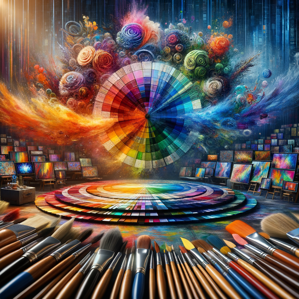
Color is a powerful tool in the hands of a digital artist. Understanding color theory not only enhances your artwork but can also bring your creative vision to life. In this article, we’ll explore the intricacies of color theory and provide practical advice for selecting and using colors in your digital creations.
Color theory is a set of principles used to understand how colors interact with one another and how they can be effectively combined to create harmonious compositions. Whether you are a beginner or a seasoned digital artist, mastering color theory is essential for elevating your art.
In this guide, we will cover the following topics:
- Basic Concepts of Color Theory
- The Color Wheel and Color Relationships
- Choosing the Right Color Palette
- The Psychology of Color
- Practical Tips for Mixing Colors
- Case Studies of Effective Color Usage in Art
Basic Concepts of Color Theory
At its core, color theory revolves around the color wheel, which visually represents the relationship between colors. The wheel is divided into primary, secondary, and tertiary colors. Understanding these color categories is the first step to applying color theory effectively.
Primary colors (red, blue, yellow) are the foundational colors from which all other colors are created. Secondary colors (green, orange, purple) are formed by mixing two primary colors, while tertiary colors are created by mixing a primary and a secondary color.
The Color Wheel and Color Relationships
The color wheel illustrates various relationships between colors, such as complementary, analogous, and triadic schemes. Complementary colors are opposite each other on the color wheel, such as red and green, which create a striking contrast when used together. Analogous colors are next to each other on the wheel, offering a more harmonious blend, like blue, blue-green, and green. Triadic color schemes utilize three colors evenly spaced on the wheel, providing a balanced and vibrant look.
Choosing the Right Color Palette
When creating a digital artwork, the choice of color palette is crucial. Each artwork requires a specific mood or theme that can be conveyed through strategic color selection. Here's how to choose the right palette:
- Identify the Mood: Determine the emotional tone you wish to evoke—warm colors can convey passion and energy, while cool colors often suggest calmness and tranquility.
- Use Color Harmony: Select colors that work well together to create visual coherence. This can involve using complementary, analogous, or monochromatic schemes.
- Test Different Palettes: Experiment with various palettes to see what resonates best with the theme of your piece.
The Psychology of Color
Colors evoke emotions and can influence perceptions. Understanding color psychology can provide insights into how to effectively communicate your art’s message. For example, blue often represents trust and peace, while red can signify excitement or anger. Consider how different audiences might react to color choices to tailor your artworks purposefully.
Practical Tips for Mixing Colors
Here are some essential tips for mixing colors in your digital artworks:
- Start with a Base Color: Choose a primary hue to build your palette around. This serves as a foundational element for your exploration.
- Experiment with Shades and Tints: Create darker shades by adding black and lighter tints by adding white to achieve desired depth.
- Utilize Color Picking Tools: Most digital painting software includes a color picker tool, which allows you to easily select and modify colors as needed.
Case Studies of Effective Color Usage in Art
Let’s examine a few renowned artists and their use of color to convey messages and evoke emotions:
- Vincent van Gogh: Van Gogh’s use of vibrant yellows and blues not only added energy to his compositions but also reflected his emotional state.
- Pablo Picasso: During his Blue Period, Picasso’s monochromatic palette of blues communicated feelings of sadness and melancholy, showcasing the emotional power of color.
- Frida Kahlo: Kahlo’s bold colors juxtaposed with dark themes expressed her personal struggles while showcasing her unique cultural identity.
By studying the color choices of these artists, you can gain insight into how to effectively employ color in your own works.
Conclusion
Color theory is a fundamental skill for any digital artist, and mastering it can profoundly enhance your artwork. By understanding color relationships, the psychology of color, and practical color mixing techniques, you can develop a strong sense of color that reflects your creative style. So, embrace color theory, experiment, and let your artistry shine through the power of colors!

