
Color is one of the most crucial elements in digital art, as it significantly impacts the mood and message of a piece. Understanding how to choose and create a color palette can elevate your work from good to extraordinary. In this comprehensive guide, we'll delve deep into color theory, practical techniques, and various methods artists can use to select and harmonize colors effectively. Whether you're a beginner or a seasoned pro, you'll find valuable insights to help you master this essential aspect of digital art.
Colors evoke emotions and tell stories. They can create depth, highlight important elements, or transport viewers to another world. In the realm of digital art, the ability to manipulate colors creatively can set your work apart. This article will explore key concepts in color theory, how to select complementary colors, and tips for creating personalized palettes.
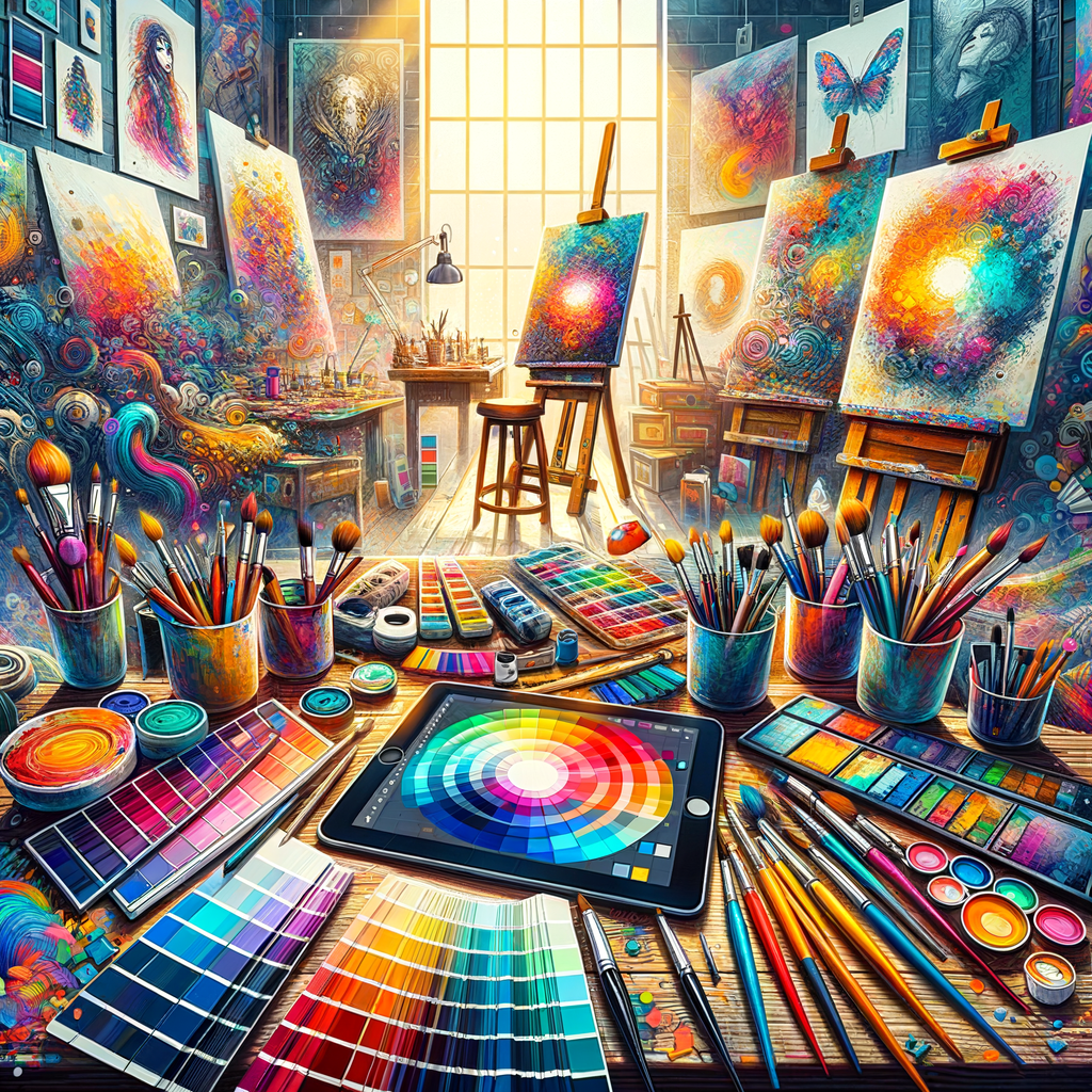
Understanding Color Theory
Before diving into practical applications, it’s essential to grasp the fundamentals of color theory. Here are several key components:
- Color Wheel: The color wheel is a visual representation of colors arranged by their chromatic relationship. Primary colors (red, blue, and yellow) can be mixed to create secondary colors (green, orange, and purple). Tertiary colors are formed by mixing primary and secondary colors.
- Warm and Cool Colors: Warm colors (reds, oranges, yellows) often evoke feelings of warmth, energy, and passion, while cool colors (blues, greens, purples) create a sense of calm and tranquility. Knowing how to use these can affect your artwork's overall tone.
- Complementary Colors: Colors opposite each other on the color wheel complement one another. Including complementary colors can enhance contrast and make specific elements stand out.
- Analogous Colors: These are colors next to each other on the wheel, creating harmonious combinations. They can give your artwork a cohesive feel.
- Triadic Colors: A color scheme based on three colors that are evenly spaced around the color wheel. This type adds vibrancy to your artwork.
Creating a Color Palette
Now that we understand basic color theory, let's look at how to create a color palette effectively:
- Start with Your Subject: Examine your subject matter and think about the emotions you want to evoke. This will guide your choice of colors. For instance, a serene landscape might use soft blues and greens, while a dynamic character portrait could employ bolder, vibrant hues.
- Establish a Dominant Color: Choose one color that will dominate your artwork. This will serve as a foundation for your palette and help establish the piece's overall mood.
- Select Complementary Colors: Choose one or two complementary colors that work well with your dominant color. This will add contrast and interest to your artwork.
- Include Neutral Colors: Incorporating neutral tones (whites, grays, and blacks) can help balance out your chosen colors, providing a respite for the eyes and adding depth.
- Test Your Palette: Before committing to your final palette, do a few tests. Create small swatches to see how the colors interact. This process can save you from making significant mistakes later in the artwork.
Using Digital Tools for Color Selection
In the digital art realm, artists have an abundance of tools at their disposal to aid in color selection. Here are some popular options:
- Adobe Color CC: This online tool allows you to create and experiment with color schemes based on the color wheel, inspiring palettes for your projects.
- Coolors.co: This user-friendly tool generates random color palettes, and you can adjust them, lock colors, or explore different combinations.
- Procreate Color Harmony: If you’re working in Procreate, explore the color harmony settings, which suggest complementary and analogous colors based on your chosen hue.
- Photoshop Color Libraries: Photoshop offers color libraries based on various models (RGB, CMYK, etc.), enabling you to find specific shades or create variations easily.
- Color Hunt: A curated collection of beautiful color palettes that you can use for inspiration in your own projects.
Practical Tips for Color Application
While selecting colors is crucial, their application can make or break an artwork. Here are some guidelines:
- Use Layers and Blending Modes: When working digitally, utilize layers and blending modes to experiment with how colors interact. Overlay and multiply modes can create stunning effects.
- Adjust Opacity: Play with the opacity levels of your colors to create depth and layers. Semi-transparent colors can add richness to your artwork.
- Focus on Lighting: The lighting in your artwork significantly affects color perception. Ensure that your colors reflect the light sources present in your piece.
Experiment and Evolve
Don’t be afraid to step out of your comfort zone and experiment with color combinations outside traditional norms. Creating a color palette is not just a technical task but a way to express your unique vision as an artist. Always embrace the learning process!
In conclusion, understanding and mastering how to create and apply color palettes is a fundamental skill in digital art. By leveraging color theory, digital tools, and practical techniques, you’ll enhance your artwork’s emotional resonance and visual appeal. So take your time exploring, testing, and refining your palettes, and watch as your digital art reaches new heights!