
Understanding color theory is a crucial skill for any artist, whether you're a beginner or a professional. The way colors interact can dramatically affect the mood, depth, and overall impact of a piece of art. In this comprehensive guide, we'll delve into the fascinating world of color theory, explore various techniques for creating harmonious color palettes, and provide practical tips for implementing these concepts into your digital artwork. Get ready to unlock the secrets of color and elevate your art to new heights!
Color theory is an expansive topic that covers the principles and guidelines for using colors effectively in art. It encompasses both the science of color and the emotional impact that colors can have. Understanding how to use color can dramatically enhance your artwork, making it more engaging and visually appealing.
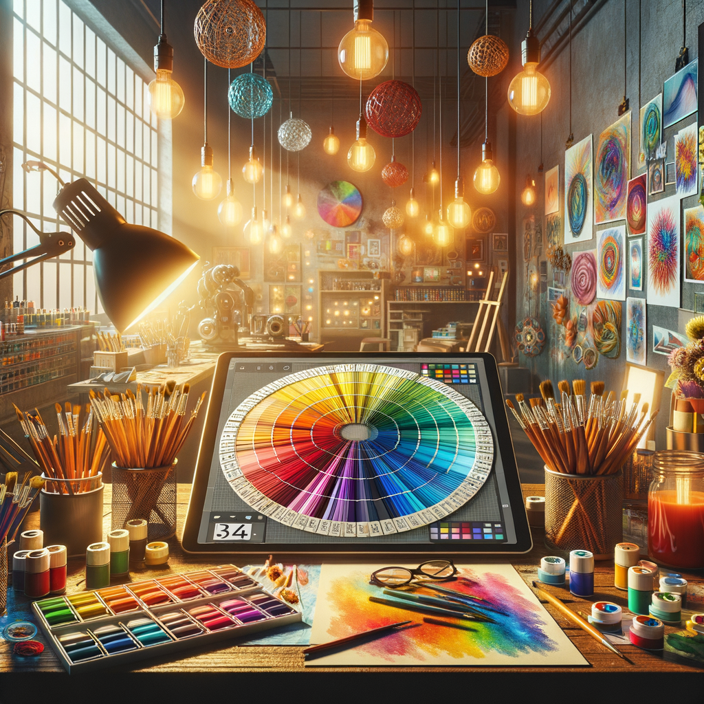
At its core, color theory can be divided into three main components: the color wheel, color harmony, and color context. Let's break down each of these components and see how they can be applied to your digital art creations.
The Color Wheel
The color wheel is a fundamental tool in color theory and serves as a visual representation of how colors relate to one another. It is typically divided into three categories: primary, secondary, and tertiary colors.
- Primary Colors: Red, blue, and yellow are the primary colors. They cannot be created by mixing other colors.
- Secondary Colors: These are created by mixing two primary colors. For example, mixing red and blue results in purple, yellow and blue make green, and red and yellow create orange.
- Tertiary Colors: These colors are made by mixing a primary color with a secondary color. Examples include red-orange and blue-green.
Artists use the color wheel to determine complementary and analogous colors, both of which are vital for creating effective color palettes.
Color Harmony
Color harmony refers to the pleasing arrangement of colors. The goal of color harmony is to create a sense of balance and visual interest in your artwork. There are several approaches to achieving color harmony, including:
- Complementary Colors: These are colors that are opposite each other on the color wheel. For instance, blue and orange are complementary. Using complementary colors together can create striking contrasts and make certain elements of your art stand out.
- Analogous Colors: These are colors that sit next to each other on the color wheel, such as blue, blue-green, and green. Using analogous colors can create serene and comfortable designs.
- Triadic Colors: This approach uses three colors that are evenly spaced on the color wheel. For example, red, yellow, and blue form a triadic color scheme, offering a sense of balance and diversity.
Experimenting with different color harmonies can help you find the perfect palette for your projects.
Creating Color Palettes
Now that we've covered the basic principles of color theory, let's discuss how to create effective color palettes for your digital art.
- Start with a Base Color: Choose a base color that will serve as the foundation of your palette. This could be a color you’re drawn to or one that fits the mood you want to convey.
- Consider the Mood: Colors evoke emotions. Warm colors like red and orange can convey excitement or anger, while cool colors like blue and green can express calmness or sadness. Think about the feeling you want your artwork to evoke.
- Utilize Color Palettes from Resources: Websites like Adobe Color and Coolors allow you to explore existing color palettes or create your own. Browse their collections for inspiration.
- Use the 60-30-10 Rule: This design principle suggests using 60% of a dominant color, 30% of a secondary color, and 10% of an accent color in your artwork to achieve visual balance.
- Test and Adjust: Once you have a color palette, test it out in your artwork. Adjust colors as necessary, because sometimes colors appear different when integrated into a piece.
Applying Color in Digital Art
When creating digital art, utilizing software tools can greatly enhance your color selection process. Here are some techniques to consider:
- Use Layers: Digital art allows for flexibility. Use layers to experiment with different colors without affecting the entire piece.
- Adjustment Layers: Programs like Photoshop offer adjustment layers that allow you to tweak colors and contrast after you’ve already painted them.
- Blending Modes: Familiarize yourself with blending modes to see how colors interact with each other on your canvas.
To illustrate these concepts, we'll explore how color can influence the perception of light and shadow in your artwork.
The Role of Color Temperature
Color temperature refers to the warmth or coolness of a color. Warm colors (reds, oranges, yellows) tend to advance in a composition, drawing attention, while cool colors (blues, greens) tend to recede, providing a background or depth.
Understanding color temperature is essential for effectively rendering light and shadow in your artwork:
- Light Source: Determine the light source in your scene. The color of the light itself can influence how colors are perceived. A warm light will cast warm shadows and vice versa.
- Cool Shadows: Often, shadows will lean towards cooler colors. Incorporate colors like blue or violet into your shadows for added realism.
- Highlights: Highlights can retain the temperature of the light source, so if you're painting with warm light, incorporate warm tones into your highlights.
Conclusion
Mastering color theory is a continuous journey for artists, but the time spent understanding these principles will pay off in the enhanced quality of your artwork. By applying the concepts of the color wheel, harmony, and context, and experimenting with color palettes, you will be able to create stunning, impactful pieces that captivate your audience. Keep practicing, explore new combinations, and most importantly, have fun while you paint!