Color is one of the most powerful tools in an artist's arsenal. Understanding color theory is essential for digital artists who wish to create visually stunning and emotionally resonant pieces. This article will guide you through the intricate world of color theory, providing practical tips, techniques, and insights on how to effectively use color in your digital artwork.
Color theory is the foundation of all visual art. It encompasses the rules and guidelines for understanding how colors interact with one another and how they can be used to create cohesive and appealing compositions. In the realm of digital art, mastering color theory can elevate your work, making it more vibrant, lifelike, and compelling.
Before diving deeper into the specifics of color theory, let’s explore the basic concepts that every artist should know.
Understanding the Color Wheel
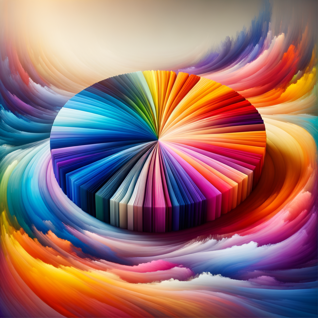
The color wheel is a circular diagram that represents the relationships between colors. It consists of primary, secondary, and tertiary colors:
- Primary Colors: Red, Blue, and Yellow. These colors cannot be made by mixing other colors.
- Secondary Colors: Green, Orange, and Purple. These are created by mixing two primary colors.
- Tertiary Colors: These are formed by mixing a primary color with a secondary color, resulting in colors like Red-Orange, Yellow-Green, and Blue-Purple.
The color wheel serves as a vital tool in helping artists understand how to create harmonious color schemes. By utilizing complementary, analogous, or triadic color schemes, you can create balance and excitement in your digital art.
Color Harmony
Color harmony refers to the aesthetically pleasing arrangement of colors. When selecting colors for your artwork, it's crucial to consider how they will work together. Here are a few common color schemes:
- Complementary Colors: Colors that are opposite each other on the color wheel. For example, blue and orange. These colors create high contrast and draw attention to focal points in your artwork.
- Analogous Colors: Colors that are next to each other on the color wheel. For instance, red, red-orange, and orange. This scheme provides a harmonious and serene effect.
- Triadic Colors: Three colors that are evenly spaced on the color wheel, such as red, yellow, and blue. This scheme offers a vibrant and dynamic appearance.
The Psychology of Color
Colors evoke emotions and can influence how viewers perceive your artwork. Here’s a brief overview of the emotional responses associated with various colors:
- Red: Passion, energy, action.
- Blue: Calm, trust, serenity.
- Yellow: Happiness, optimism, warmth.
- Green: Growth, harmony, freshness.
- Purple: Luxury, creativity, mystery.
- Orange: Enthusiasm, excitement, warmth.
- Black: Power, sophistication, elegance.
- White: Purity, simplicity, cleanliness.
Understanding color psychology can help you make deliberate choices in your artwork that convey the emotions you want your audience to feel.
Creating a Color Palette
Choosing a color palette is one of the most critical decisions in the art creation process. Here are some steps to help you develop a cohesive color palette:
- Define the Mood: Consider the emotions and themes you want to express in your artwork.
- Select a Dominant Color: Choose one primary color that will stand out and set the tone for your piece.
- Add Supporting Colors: Select complementary or analogous colors that will enhance your dominant color without overshadowing it.
- Test Your Palette: Create small color swatches to see how the colors work together before applying them to your final piece.
Advanced Techniques in Color Usage
Once you have the basics down, you can experiment with advanced techniques to push the boundaries of your color usage in digital art. Here are some techniques to consider:
- Layering Colors: Experiment with different blending modes and opacity levels to create depth and texture in your artwork.
- Using Light and Shadow: Pay attention to how light interacts with color. Use shadows and highlights to create dimension and realism.
- Color Grading: After completing your artwork, consider applying a color grade to unify the piece and enhance its mood.
- Using Textures: Incorporate textures that can alter the perception of color and add an additional layer of complexity to your image.
Conclusion
Mastering color theory is an ongoing journey for any digital artist. By understanding the principles of the color wheel, color harmony, and the psychology of color, you can create artwork that is not only technically proficient but also deeply impactful. Remember, practice is essential; experiment with your palettes and color schemes regularly to discover what works for you. As you grow in your understanding of color, your ability to bring your visions to life will only improve.

