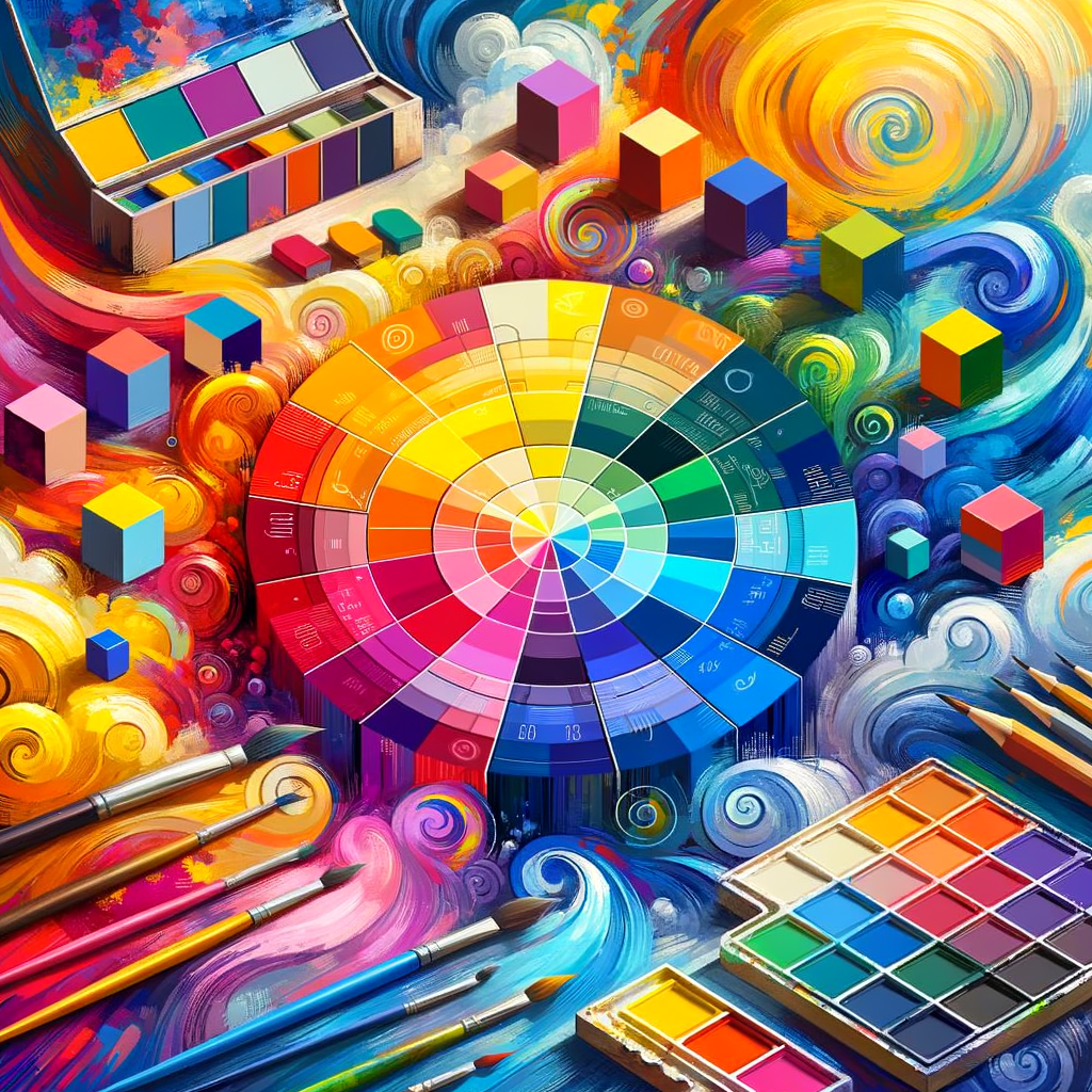
Color theory is a fundamental aspect of creating stunning digital art. Understanding how colors interact, complement, and contrast can elevate your artwork to new heights. In this comprehensive guide, we will delve into the principles of color theory, provide practical tips for selecting color palettes, and explore how to mix and apply colors effectively in your digital paintings. Whether you're a beginner or an experienced artist, mastering color theory is essential for conveying emotions, setting moods, and creating dynamic compositions. Let's embark on this colorful journey together!
Color theory is not just an abstract concept; it's a practical toolkit that digital artists can use to enhance their work. By understanding the relationships between colors, you can create more harmonious pieces and effectively convey the mood you want the viewer to feel.
This article is structured into several key sections, each focusing on different aspects of color theory. We'll cover the color wheel, color harmony, the psychology of color, practical tips for creating color palettes, and much more.
The Color Wheel
At the core of color theory is the color wheel, a visual representation of colors arranged in a circle. This wheel consists of primary colors, secondary colors, and tertiary colors:
- Primary Colors: These colors cannot be created by mixing other colors. They are red, blue, and yellow.
- Secondary Colors: These colors are created by mixing two primary colors. For example, mixing red and blue creates purple.
- Tertiary Colors: These colors are formed by mixing a primary color with a secondary color, resulting in shades like red-orange or yellow-green.
Understanding the color wheel is crucial for any artist, as it helps you visualize how colors relate to one another. Additionally, it can guide you in creating a balanced composition by selecting colors that work well together.
Color Harmony
Color harmony refers to how colors work together in a piece of art. There are several methods to achieve color harmony:
- Complementary Colors: These are colors that are opposite each other on the color wheel, such as blue and orange. Using complementary colors can create vibrant contrasts in your artwork.
- Analogous Colors: These are colors that are next to each other on the wheel, like blue, blue-green, and green. They create a serene and composed look.
- Triadic Colors: This scheme involves three colors evenly spaced around the color wheel, such as red, yellow, and blue. It offers a balanced yet dynamic feeling.
Understanding and applying these color harmony techniques will significantly improve your compositional skills and make your paintings more visually appealing.
The Psychology of Color
Different colors evoke various emotions and reactions in viewers. Here’s a brief overview of what common colors represent:
- Red: Passion, energy, danger.
- Blue: Calm, tranquility, sadness.
- Yellow: Happiness, optimism, caution.
- Green: Nature, growth, health.
- Purple: Luxury, creativity, mystery.
When creating digital art, consider the emotions you wish to convey and select your color palette accordingly. Understanding color psychology can guide you in crafting narratives through your artworks.
Creating Color Palettes
Creating a cohesive color palette is vital for any digital artist. Here are some tips to help you:
- Start with a base color: Choose a color that will serve as the foundation for your palette.
- Add shades and tints: Incorporate variations of your base color by adding black (shades) or white (tints).
- Use a color scheme generator: Online tools can help you generate harmonious color palettes quickly.
- Limit your palette: Use a select number of colors (4-6) to avoid overwhelming your artwork.
Experiment with different palettes and document which ones resonate with you. This practice will develop your understanding of color use over time.
Color Mixing Techniques
When it comes to mixing colors, there are two primary methods—additive and subtractive mixing:
- Additive Mixing: This involves mixing colored light, as seen in digital art. Combining different colors of light results in lighter colors (e.g., red + green = yellow).
- Subtractive Mixing: This is what happens when you mix pigments or paint. Mixing various colors results in darker colors (e.g., yellow + blue = green).
Understanding these methods will enhance your ability to create vibrant, dynamic artwork.
Conclusion
In conclusion, mastering color theory is an essential tool for any digital artist. By understanding the color wheel, applying color harmony, recognizing the psychology of color, creating effective palettes, and mastering mixing techniques, you can elevate your artwork and convey the emotions you desire. Regular practice and experimentation will help you become more proficient in using color effectively. Start applying these principles in your next digital painting, and witness your art transform!

