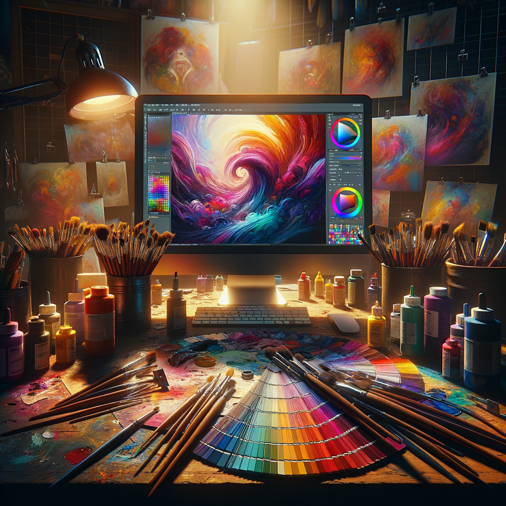
Color is an essential element in any artwork, influencing the mood, depth, and overall impact of a piece. Understanding how to effectively choose and combine colors can elevate your digital art to new heights. This comprehensive guide dives into the principles of color theory and offers practical advice for selecting the perfect color palette for your next creative project, whether you're a beginner or a seasoned artist. Let’s explore how color can transform your art and discover techniques to master this fundamental aspect of creativity.
Color theory is not just a set of rules; it's a framework that artists use to create visually appealing compositions. The effective use of color can make the difference between a mediocre piece of art and a stunning masterpiece. In this guide, we'll cover key principles of color theory, the psychology of color, and practical steps to help you choose the right color palette for your digital art.
Understanding Color Theory
The basis of color theory lies in the color wheel, which was first developed by Sir Isaac Newton in the 17th century. The color wheel consists of primary, secondary, and tertiary colors:
- Primary Colors: Red, Blue, Yellow. These colors cannot be created by mixing other colors.
- Secondary Colors: Green, Orange, Purple. These colors are created by mixing two primary colors.
- Tertiary Colors: Colors created by mixing a primary color with a secondary color (e.g., Red-Orange, Yellow-Green).
It's crucial to understand these relationships as they form the foundation of color mixing and harmony.
The Color Wheel and Color Harmony
Beyond just mixing colors, the color wheel allows artists to find color harmony. Here are some common color schemes that can help you achieve balance and visual interest in your artwork:
- Complementary Colors: Colors that are opposite each other on the color wheel (e.g., Red and Green). They create high contrast and vibrant compositions.
- Analogous Colors: Colors that are next to each other on the color wheel (e.g., Blue, Blue-Green, and Green). They create a serene and harmonious look.
- Triadic Colors: A color scheme that uses three colors evenly spaced around the color wheel (e.g., Red, Yellow, Blue). This produces a lively and balanced palette.
- Tetradic Colors: Combines two complementary color pairs. It offers richness and complexity but needs careful balance.
Choosing the right color scheme is essential for setting the mood and tone of your artwork. For instance, warm colors (reds, oranges, yellows) evoke feelings of warmth and excitement, while cool colors (blues, greens, purples) convey calmness and relaxation.
The Psychology of Color
Colors have psychological effects on viewers. This is an essential aspect for artists to consider when creating art. Here are some common interpretations of colors:
- Red: Passion, energy, danger.
- Blue: Trust, calmness, professionalism.
- Green: Nature, health, tranquility.
- Yellow: Happiness, warmth, positivity.
- Purple: Luxury, creativity, wisdom.
- Black: Elegance, power, sophistication.
- White: Purity, simplicity, innocence.
By understanding the psychological implications of colors, artists can make informed choices that align with the message they wish to convey.
How to Choose a Color Palette
Now that we’ve covered the basics, let's discuss practical methods for selecting your color palette:
- Start with Inspiration: Look at photos, artworks, or nature for inspiration. Identify color combinations that resonate with you.
- Use Color Palette Generators: Tools like Adobe Color, Coolors.co, or Paletton can help create harmonious palettes based on your chosen color.
- Limit Your Colors: Choose a specific number of colors (3 to 5) to avoid overwhelming your composition. This keeps your artwork focused.
- Test Your Palette: Before applying colors directly to your artwork, experiment with them in a sketch to see how they interact.
- Adjust as Needed: Don't hesitate to tweak your palette. Art is an iterative process, and adjustments can lead to stunning results.
Choosing a color palette is an essential step in the artistic process. It lays the groundwork for the visual impact of your artwork.
Working with Colors in Digital Art
Digital tools offer unique advantages when it comes to working with color. Here are some tips:
- Layers: Utilize layers to separate colors and elements of your artwork. This lets you easily adjust colors without affecting other parts of your piece.
- Brush Settings: Experiment with brush settings in programs like Photoshop or Procreate to achieve different textures and effects.
- Color Adjustments: Use color adjustment tools (like Hue/Saturation) to refine your palette and ensure consistency throughout your artwork.
- Color Profiles: Be mindful of your color profiles. Working in RGB mode can yield vibrant colors, but converting to CMYK for print impacts your color choices.
Utilizing digital tools can enhance your color selection process, making it more straightforward and adaptable.
Conclusion
Mastering the art of color is a lifelong journey for any artist. By understanding color theory, exploring the psychology of color, and learning how to choose the right palette, you can elevate your artwork and convey deeper messages through your art. Whether you are a beginner or a seasoned professional, experimenting with colors keeps your art fresh and exciting. Start applying these practices in your next project, and watch your digital art flourish.

