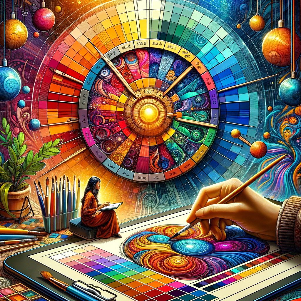
Color theory is a fundamental aspect of art that greatly influences the mood, impact, and appeal of a piece. Whether you're a beginner trying to find your way or a seasoned artist looking to refine your skills, mastering color theory can elevate your digital artwork to new heights. In this comprehensive guide, we will explore the principles of color theory, the significance of color palettes, and practical tips on how to apply these concepts in your digital creations.
Color theory is a broad field that encompasses various components, including the color wheel, color harmony, the psychology of colors, and their applications in art. Understanding these elements is essential for creating works that resonate with viewers and convey the intended message.
Let’s start by discussing the basics of the color wheel. The color wheel is a circular diagram that arranges colors in relation to one another. It is divided into primary, secondary, and tertiary colors:
- Primary Colors: Red, blue, and yellow. These colors cannot be created by mixing others.
- Secondary Colors: Green, orange, and purple. These are formed by mixing two primary colors.
- Tertiary Colors: Colors like red-orange and blue-green, which are made by mixing a primary color with a secondary color.
Understanding the color wheel allows you to create color combinations that are visually appealing and effective in your artwork.
Next, let’s explore color harmony, which refers to the aesthetically pleasing arrangement of colors. There are several schemes that artists often use:
- Complementary Colors: Colors that are opposite each other on the color wheel, such as red and green. These combinations create high contrast and draw attention.
- Analogous Colors: Colors that are next to each other on the wheel, like blue, blue-green, and green. They create serene and comfortable designs.
- Triadic Colors: A scheme that uses three colors that are evenly spaced around the wheel, like red, yellow, and blue. This arrangement is vibrant and can be used creatively.
Understanding these harmonies is crucial for artists aiming to create balanced and engaging compositions.
Now that we have covered the basics, let’s delve into the psychology of colors. Each color evokes different emotions and interactions. For instance:
- Red: Passion, energy, and anger.
- Blue: Calmness, trust, and sadness.
- Yellow: Happiness, warmth, and caution.
By understanding color psychology, artists can select colors that enhance the emotional aspect of their work and communicate the desired message effectively.
So how do we choose the perfect color palette for our digital art? Here are some practical tips:
- Define Your Mood: Identify the mood or emotion you want to convey and choose colors that align with that feeling. For instance, use cool colors for a calm scene or warm colors for an energetic vibe.
- Use a Color Palette Generator: Various online tools can help you create appealing color palettes. Experiment with different combinations until you find one that resonates with your vision.
- Limit Your Palette: Especially for beginners, it can be helpful to limit your palette to a few colors to maintain harmony and avoid overwhelming the artwork.
- Study Existing Art: Look at works from artists you admire. Analyze their color choices and try to understand what effect those colors have on the overall piece.
Color theory is a skill that takes time to master. Regular practice and experimentation are key to enhancing your understanding of colors. Digital art offers a unique opportunity to play with colors in ways traditional media might not allow.
In subsequent sections, we will delve deeper into tools and techniques for using color in your digital paintings, ways to handle complex color blending, and the importance of lighting in color perception.
Another important aspect to consider when working with color is the effect of light on color perception. The way colors appear can change based on lighting conditions. For instance, bright daylight can make colors appear more vibrant, while softer indoor lighting may mute them. Understanding these principles can help you make better choices when setting up your digital canvas.
Working with layers is another powerful technique in digital art. With layers, you can experiment with different color combinations without affecting the original artwork. This flexibility allows for creativity and exploration without the fear of making irreversible mistakes.
Moreover, consider learning about various brushes and tools available in digital painting software. Photoshop, Procreate, and other applications offer a multitude of brushes that can simulate traditional media, allowing you to blend colors and create textures effectively. Experimenting with these tools can lead to discovering your unique style and enhancing your color application.
In this guide, we aim to cover every aspect of color theory relevant to digital artists. By the end of this article, you will be equipped with the knowledge and tools necessary to choose and apply colors effectively in your art. Whether your aim is to evoke particular feelings or create aesthetic marvels, understanding color thoroughly will serve as a significant asset in your artistic toolkit.
As we further unfold the intricacies of color, remember that practice is essential. Keep creating, experimenting with your palettes, and refining your understanding of color theory. The journey of mastery is ongoing, and every stroke of the brush is an opportunity to learn something new.

