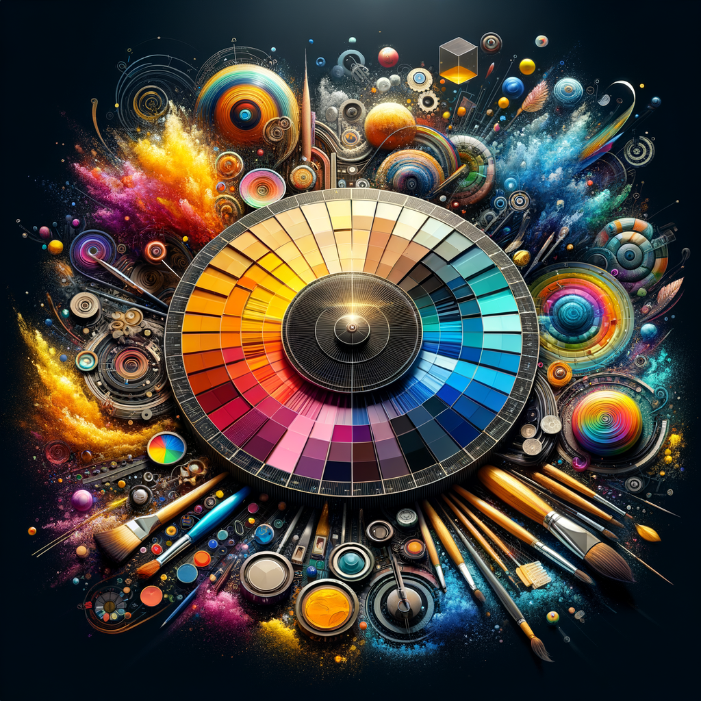
Color is not just an aesthetic choice; it communicates emotions, sets the mood, and can transform an ordinary artwork into something extraordinary. In the realm of digital art, understanding color theory is essential for any artist looking to elevate their work. This comprehensive guide aims to provide you with the fundamental principles of color, tips on creating effective color palettes, and techniques to enhance your artistic endeavors. Whether you're a beginner or a seasoned professional, mastering color will take your art to the next level.
In this article, we will delve deep into the world of color and its importance in digital art. Understanding how to use color effectively can significantly enhance the impact of your artworks. Let's start by exploring some basic color theory concepts that every artist should know.
Understanding Color Theory
Color theory is a set of principles used to understand the relationship between colors. It encompasses concepts such as the color wheel, color harmony, and the psychological effects of color. By grasping these ideas, you can make more informed choices about the colors you use in your digital artwork.
The color wheel is fundamental in color theory. It is divided into primary, secondary, and tertiary colors:
- Primary Colors: Red, blue, and yellow. These colors cannot be made by mixing other colors.
- Secondary Colors: Green, orange, and purple. These are created by mixing two primary colors.
- Tertiary Colors: Colors formed by mixing a primary color with a secondary color.
Understanding how these colors interact will help you create dynamic and visually appealing compositions.
Color Harmonies
Color harmony is the pleasing arrangement of colors. Here are some common types of color harmonies you can use in your digital art:
- Complementary Colors: Colors that are opposite each other on the color wheel (e.g., blue and orange). They create a vibrant look when used together but can be overwhelming if not balanced.
- Analogous Colors: Colors that are next to each other on the color wheel (e.g., red, red-orange, and orange). They create serene and comfortable designs.
- Triadic Colors: Colors that are evenly spaced around the color wheel (e.g., red, yellow, and blue). They offer vibrant and diverse compositions.
Experiment with these harmonies to discover the combinations that resonate with your artistic style.
Creating Effective Color Palettes
A color palette is a selected range of colors for your artwork. When creating a palette, consider the following tips:
- Limit Your Palette: Too many colors can make your artwork confusing. Stick to a limited palette of 3-5 colors to create a cohesive look.
- Use Shades and Tints: By adding black or white to your colors, you can create shades and tints, allowing for more variety without straying from your chosen colors.
- Check the Contrast: Ensure that there’s enough contrast between your colors to maintain visibility and clarity in your artwork.
Consider using online tools like Adobe Color or Coolors to experiment with and generate color palettes.
Applying Color in Digital Art
When painting digitally, here are some techniques to enhance your color application:
- Layering: Use multiple layers to build your colors gradually. Start with a base color and gradually add shadows and highlights to add depth.
- Blending: Experiment with different blending modes to see how colors interact. This can create interesting effects and transitions in your artwork.
- Brush Dynamics: Adjust the opacity and flow of your brushes for more variations in color intensity.
Don’t hesitate to play around with different techniques to see what works best for your specific style or project.
Color and Emotion
Colors can evoke specific emotions or messages. For instance:
- Red: Represents passion, energy, and danger.
- Blue: Conveys calmness, sadness, and stability.
- Yellow: Associated with happiness, optimism, and warmth.
Think about the emotions you wish to evoke in your audience when selecting your color scheme.
Practical Exercises
To practice your color skills, consider these exercises:
- Monochromatic Study: Create a piece using only one color with variations in shade and tint.
- Color Thumbnails: Experiment with small thumbnails using different color palettes to see how they change the feel of the piece.
- Mastercopy: Choose a favorite artwork and try to replicate the colors used. This can help you understand how professionals apply color effectively.
Engaging in these exercises will develop your abilities to use color more confidently in your work.
Conclusion
Mastering color is a crucial step toward enhancing your digital art. By understanding color theory, utilizing effective color harmonies, and continually practicing your skills, you can create artwork that is not only visually stunning but also emotionally impactful. Take the time to experiment with color in your projects, and don't be afraid to take risks. The results might surprise you and lead to the development of your unique style.
Happy creating!

