Color is an essential element of art that can evoke emotions, set the mood, and ultimately define a work. For digital artists, understanding color theory is fundamental to creating beautiful and impactful art. This article delves into the basics of color theory, its importance, and practical applications that can help artists at any level enhance their work. Whether you're a beginner just starting out or a seasoned professional looking to refine your skills, mastering color theory will take your digital art to new heights.
Color theory consists of the principles and guidelines that artists and designers use to understand how colors interact with each other. It involves the relationships between colors, the color wheel, and concepts such as hue, saturation, and brightness. By understanding these principles, digital artists can choose colors more wisely to achieve their desired effects.
The Color Wheel
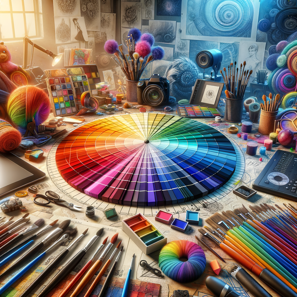
One of the foundational tools in color theory is the color wheel, a circular diagram that illustrates the relationships between colors. The primary colors, red, blue, and yellow, are spaced evenly around the wheel. When mixed, these colors create secondary colors: green, orange, and purple. Beyond this, tertiary colors emerge from mixing primary and secondary colors, expanding the wheel further.
Color Harmony
Color harmony refers to the aesthetically pleasing combination of colors within a work of art. There are several color harmony models that artists can use to create visual coherence in their pieces:
- Analogous Colors: These are colors that are next to each other on the color wheel. They create serene and comfortable designs when used together.
- Complementary Colors: Colors that are opposite each other on the color wheel, such as blue and orange, create vibrant contrasts when paired, drawing attention to specific areas of a composition.
- Triadic Colors: A triadic color scheme involves using three colors that are evenly spaced around the color wheel. This creates a vibrant and dynamic look.
- Split-Complementary Colors: This scheme consists of a base color and the two colors adjacent to its complementary color, providing more variety and interest than a standard complementary scheme.
Building a Color Palette
When creating digital art, establishing a strong color palette can make a significant difference. A color palette is a set of colors selected for a particular artwork. Here are some steps to build an effective color palette:
- Choose a Dominant Color: Start by selecting a dominant color that reflects the mood or theme of your artwork.
- Select Supporting Colors: Choose one or two colors that complement your dominant color. Consider using analogous or complementary colors to maintain harmony.
- Add Accent Colors: Incorporate a few accent colors that provide contrast and highlight specific elements of your artwork.
- Test and Adjust: Don't hesitate to experiment and adjust your palette as the artwork progresses. Sometimes, unexpected combinations can yield astonishing results.
The Psychology of Color
Understanding the psychological effects of color can further enhance your digital art. Different colors evoke different emotions and reactions, and being aware of these associations can allow you to communicate more effectively through your artwork:
- Red: Often associated with passion, energy, and danger, red can evoke strong emotions.
- Blue: Typically linked to calmness, stability, and trust, blue can create a sense of serenity.
- Yellow: Representing optimism, happiness, and energy, yellow can grab attention and evoke feelings of cheerfulness.
- Green: Symbolizing nature, growth, and renewal, green is known for its calming effects.
- Purple: Often associated with luxury, creativity, and mystery, purple can add a touch of sophistication.
- Black: Representing elegance and sophistication, black can also convey a sense of power or mystery.
- White: Symbolizing purity, simplicity, and cleanliness, white can create a sense of space.
Practical Applications
As you gain a deeper understanding of color theory, you can start applying these concepts to your digital art. Here are some practical tips to incorporate color theory into your artwork:
- Use Reference Images: When working on a piece, look at reference images to study color combinations and palettes used by other artists.
- Practice Color Mixing: Use software tools that allow you to experiment with blending and mixing colors to see how they interact.
- Limit Your Palette: Restricting your color choices to a limited palette can lead to more cohesive and aesthetically pleasing works.
- Get Feedback: Share your work with peers or online communities and ask for feedback about your color choices.
Conclusion
Mastering color theory is an essential skill for any digital artist. By understanding the relationships between colors and the emotions they can evoke, you can create visually stunning and impactful artworks. Remember that color is not just a tool; it is a language that can communicate your ideas and feelings to the audience. By continually practicing color theory and experimenting with your palette, you'll unlock your artistic potential and take your digital art to new heights.

