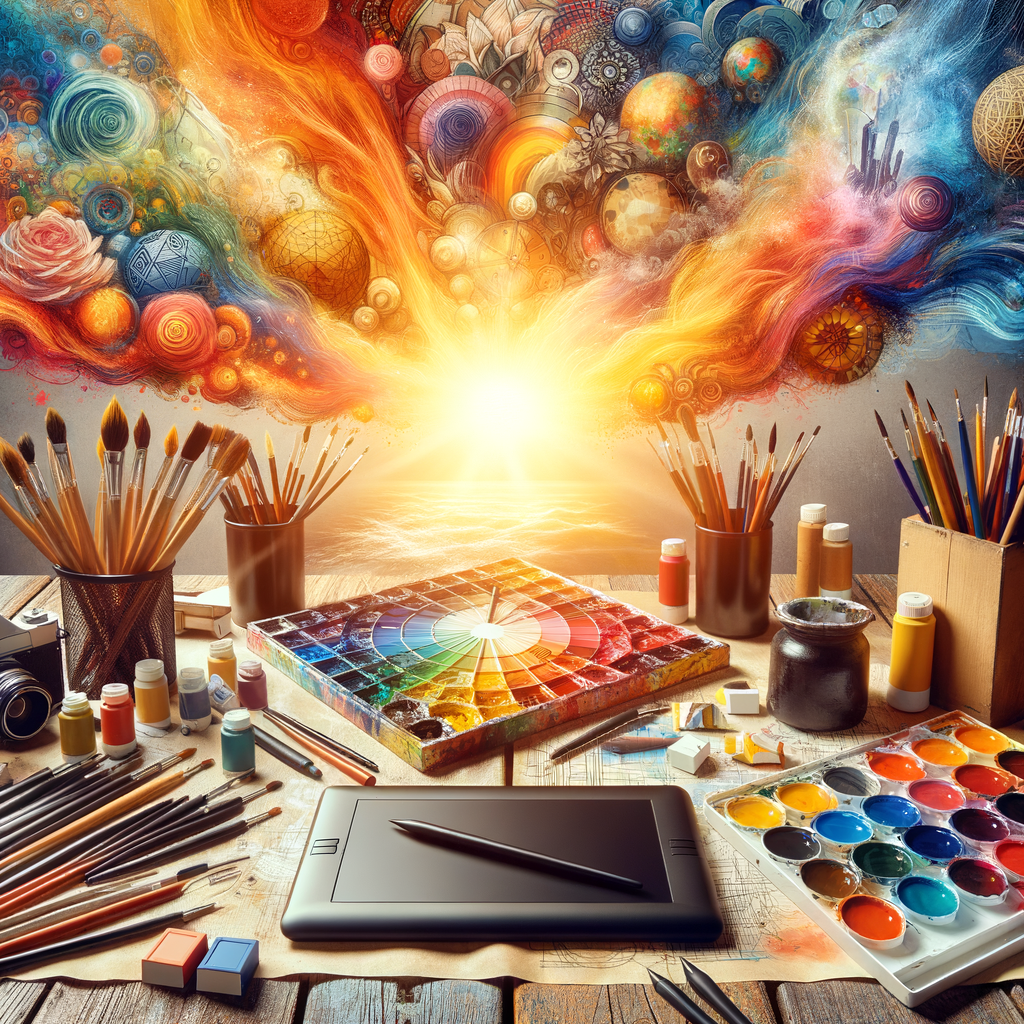
Color is an essential element in digital art, influencing mood, depth, and emotion in an artwork. A well-crafted color palette can elevate your work from ordinary to extraordinary. In this comprehensive guide, we will delve into the world of color theory, exploring the fundamentals of color mixing, the importance of understanding color harmonies, and practical tips for creating beautiful color palettes that enhance your digital creations. Whether you’re a beginner looking to grasp the basics or an experienced artist seeking to refine your skills, this article will provide you with the insights you need to master color in your digital artwork.
Color theory is the backbone of visual arts, providing a framework for understanding how colors interact with each other and how they can be effectively used to convey emotions and ideas. In this section, we will cover the basic principles of color theory, including the color wheel, primary, secondary, and tertiary colors, as well as warm and cool colors.
The color wheel is a circular diagram that represents the relationship between different colors. The three primary colors—red, blue, and yellow—cannot be created by mixing other colors but can be combined to make secondary colors (green, orange, and purple). Tertiary colors are created by mixing a primary color with a secondary color, resulting in hues like red-orange and yellow-green.
Understanding warm and cool colors is crucial for any artist. Warm colors, such as red, orange, and yellow, evoke feelings of warmth and excitement, while cool colors, like blue, green, and purple, tend to create a calm and serene atmosphere. By mastering the use of warm and cool colors, artists can manipulate the emotional response of their audience.
Once you have a solid understanding of basic color theory, it’s time to explore color harmonies. Color harmony refers to the pleasing arrangement of colors that are typically used together in a composition. Popular types of color harmonies include:
- Complementary Colors: Colors located directly opposite each other on the color wheel. For example, red and green are complementary colors. Using complementary colors can create vibrant contrasts in your artwork.
- Analogous Colors: Colors that are next to each other on the color wheel. For instance, blue, blue-green, and green. This harmony tends to be more serene and comfortable.
- Triadic Colors: Three colors that are evenly spaced around the color wheel, such as red, yellow, and blue. This allows for a vibrant and balanced palette.
- Tetradic Colors: A four-color scheme consisting of two complementary color pairs, offering a rich and complex palette.
Experimenting with different color harmonies can lead to exciting results. Try using complementary colors to draw attention to specific areas of your artwork, or utilize analogous colors for a more peaceful and cohesive look.
When creating digital color palettes, it’s essential to choose colors that work well together and reflect the mood you wish to convey. Here are several tips for crafting stunning color palettes:
- Start with a Base Color: Choose a dominant color that reflects your desired mood or theme. From there, you can build your palette by selecting complementary or analogous colors.
- Limit Your Palette: While it may be tempting to use every color in the rainbow, limiting your palette can lead to a more cohesive and harmonious look. Aim for around three to five main colors and consider adding shades and tints for diversity.
- Utilize Online Tools: There are many online tools available for color palette generation, such as Adobe Color, Coolors, and Palette Generator. These tools can help you find colors that complement each other beautifully.
- Analyze Other Artworks: Study the color palettes of artists you admire. Take note of how they use color to create mood, depth, and interest in their work.
Once you have created your color palette, test it out in your digital artwork. Apply your chosen colors to different elements of your piece, adjusting as necessary to achieve your desired effect. Remember that colors can appear differently depending on their surroundings, so experiment with different settings to see how they interact.
Another important aspect to consider when working with color is lighting. The way light interacts with surfaces affects the perception of color. Understanding how to depict lighting effectively can add realism to your artwork and enhance your color palette. Consider the light source in your composition and how it will impact the colors you choose.
As you develop your skills in creating color palettes, don’t be afraid to break the rules of color theory! Art is a personal journey, and sometimes the most captivating works emerge from unexpected choices. Trust your instincts and have fun experimenting with color.
To help you further, here are some practical exercises to improve your color palette creation skills:
- Palette Swatches: Create swatches for different color schemes, selecting colors that work well together. Try creating a set of swatches based on various themes, moods, or seasons.
- Color Studies: Choose an artwork you admire and replicate it using your color palette. Analyze how the original artist used color and compare it with your interpretation.
- Daily Color Challenge: Challenge yourself to create a new color palette every day for a week. Use different prompts or themes to inspire your choices.
In conclusion, mastering color in digital art is a vital skill that can significantly enhance your artwork. By understanding color theory, experimenting with different palettes, and trusting your creativity, you can create stunning and impactful digital pieces that resonate with viewers. Embrace the journey of learning about color and allow it to elevate your artistic practice. Happy painting!

