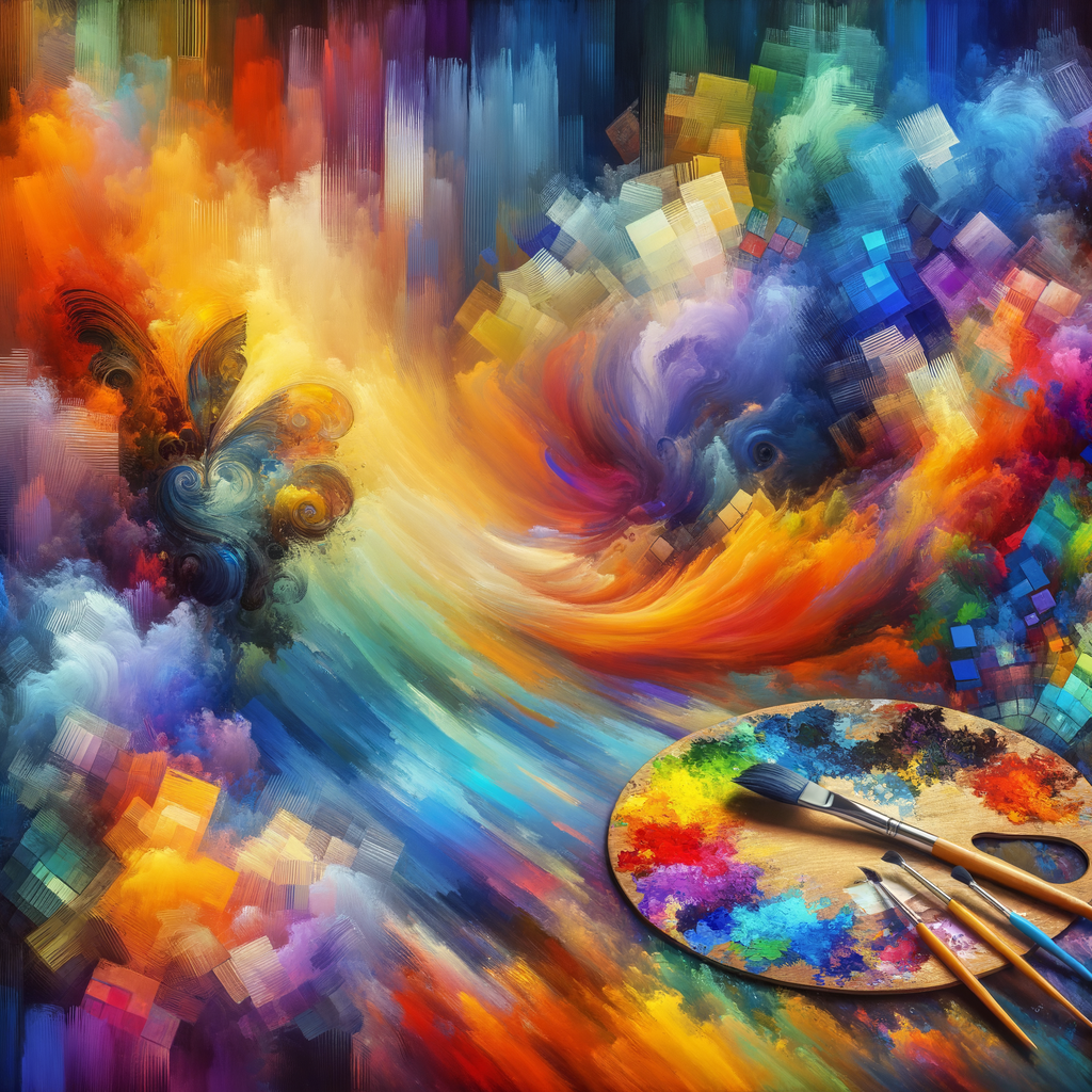
Color is one of the most powerful tools in an artist's arsenal, capable of conveying emotions, setting the atmosphere, and enhancing the visual appeal of artwork. For digital artists, understanding color theory is crucial in creating compelling and harmonious pieces. This article will delve into the fundamentals of color theory, explore how to effectively choose color palettes, and provide practical exercises to improve your color skills in digital art.
Color theory encompasses a set of principles used to understand how colors interact, mix, and affect one another. Knowing how to apply these principles can profoundly impact your artwork. Firstly, let’s explore the essential components of color theory:
- Color Wheel: This is a circular diagram of colors that shows the relationship between primary, secondary, and tertiary colors. The primary colors are red, blue, and yellow. Secondary colors are created by mixing primary colors, such as green (blue + yellow), orange (red + yellow), and purple (red + blue). Tertiary colors are formed by mixing a primary color with a secondary color.
- Warm and Cool Colors: Warm colors (reds, oranges, yellows) tend to evoke warmth and energy, while cool colors (blues, greens, purples) can create a sense of calm and tranquility. Understanding the emotional impact of colors can help you set the desired mood in your artwork.
- Complementary Colors: These are colors located opposite each other on the color wheel. When used together, they create a striking contrast that can make your artwork pop. Examples include red and green, blue and orange, and yellow and purple.
- Analogous Colors: These colors are found next to each other on the color wheel and often match well. They provide more harmony when combined, such as blue, blue-green, and green.
- Triadic Colors: This refers to three colors that are evenly spaced around the color wheel. For instance, the primary colors red, yellow, and blue create a vibrant palette when used together.
- Color Value: This refers to the lightness or darkness of a color. Artists adjust values to create depth and dimension in their work. Lighter versions of colors are called tints, and darker versions are called shades.
Now that we’ve covered the basics, let’s discuss how to effectively choose and mix colors for your digital artwork.
Choosing Color Palettes
Selecting the right color palette is key to achieving the desired aesthetic in your artwork. Here are some tips to help you make informed choices:
- Start with Inspiration: Look at references from nature, photography, or existing artworks that resonate with your vision. Analyze their color schemes to understand how colors were used to evoke emotions.
- Use Color Generators: Digital tools like Adobe Color, Coolors, and Color Hunt can help you create color palettes. You can input a base color, and these tools will generate complementary and analogous colors.
- Limit Your Palette: A limited color palette can help keep your artwork cohesive. Aim for 3 to 5 main colors and a few neutral tones to balance them out.
- Experiment with Contrast: Balance bright and dull colors or warm and cool colors to create visual interest in your artwork.
Practical Exercises to Improve Color Skills
Practicing your color skills is essential for mastering color theory. Here are a few exercises to help you improve:
- Color Mixing: Take a selection of paint or digital colors and mix them to create new shades. This will help you understand how colors interact and how to achieve the desired hues in your artwork.
- Paint a Monochromatic Piece: Create a piece using only one color but varying its values. This will help you focus on the light and shadows while improving your understanding of color value.
- Analyze Color in Famous Artworks: Choose a few famous paintings and attempt to replicate their color palettes. Analyze what you learn about color use and how it affects the overall impact of the work.
- Digital Color Studies: Use software like Procreate or Adobe Photoshop to create small color studies. Focus on applying different color combinations, effects, and textures.
Understanding Color Context
When using color in your artwork, remember that context matters. The same color can evoke different emotions depending on cultural associations, personal experiences, and the colors surrounding it. Always consider the context in which your colors are placed, as they will affect how the viewer perceives them.
Conclusion
Mastering color theory is a vital skill for any digital artist. It takes practice, experimentation, and a willingness to learn. By understanding the principles of color interaction, choosing effective color palettes, and honing your mixing skills, you can elevate your artwork and make it resonate with your audience. Happy painting!

