
Color is one of the most powerful tools in the arsenal of a digital artist. It influences emotion, creates depth, and can completely transform a piece of art. However, mastering color theory and knowing how to choose the right color palette can be daunting, especially for beginners. In this article, we will delve into the fundamentals of color theory, discuss how colors interact with one another, and provide you with practical tips on selecting the perfect color palette for your digital artwork. Whether you're creating illustrations, concept art, or character designs, understanding color will elevate your work and help you express your artistic vision more effectively. So, let’s dive into the vibrant world of colors!
Color theory is the study of how colors interact, the principles behind color mixing, and the meaning attributed to different colors. Understanding this theory can significantly enhance the quality of your digital artworks. Below, we explore a variety of concepts and tools that can help you master color selection.
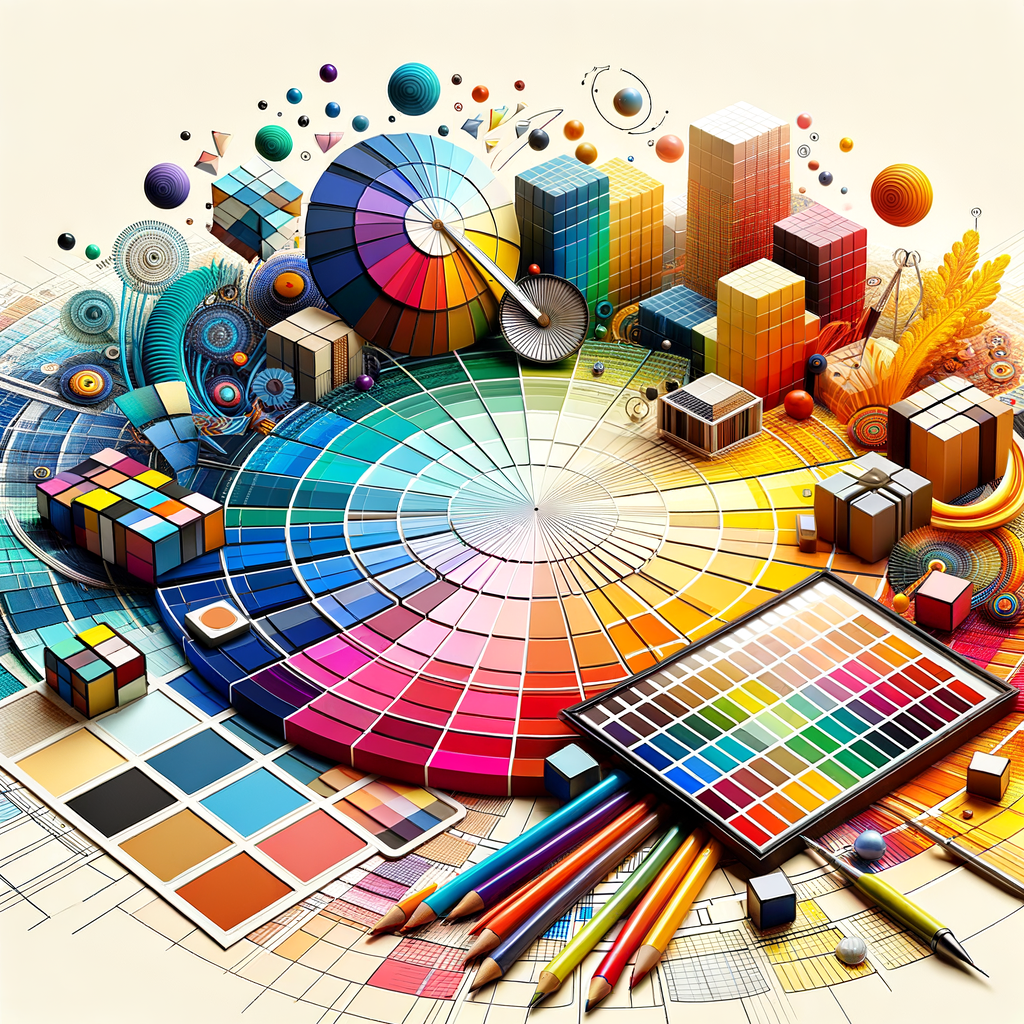
1. The Color Wheel
The color wheel is a fundamental tool in color theory. It displays the spectrum of colors arranged in a circular format:
- Primary Colors: Red, Yellow, and Blue. These cannot be made by mixing other colors.
- Secondary Colors: Green, Orange, and Purple. These are created by mixing primary colors.
- Tertiary Colors: These are made by mixing primary and secondary colors.
Understanding the color wheel is essential for recognizing relationships between colors.
2. Color Harmony
Color harmony refers to aesthetically pleasing color combinations that create a sense of balance. Some common types of color harmony include:
- Complementary: Colors that are opposite each other on the color wheel, such as blue and orange.
- Analogous: Colors that are next to each other on the wheel, such as blue, blue-green, and green.
- Triadic: Using three colors that are evenly spaced on the wheel, like red, yellow, and blue.
Choosing harmonious colors can create visually appealing art, so experiment with different combinations!
3. Psychological Effects of Color
Colors evoke emotions and convey messages. Understanding how different colors affect perception is crucial during the color selection process:
- Red: Energy, passion, and danger.
- Blue: Trust, calmness, and sadness.
- Green: Growth, harmony, and nature.
- Yellow: Happiness, optimism, and caution.
- Purple: Creativity, mystery, and luxury.
Think about the message you want to convey with your artwork and choose your color palette accordingly.
4. Tools for Selecting Colors
Today, digital artists have access to a variety of tools to assist in choosing colors:
- Color Pickers: Software such as Adobe Photoshop and Procreate offers color wheels and sliders to help artists find the right color.
- Palettes: Websites like Coolors and Adobe Color allow you to create and browse through a wide array of pre-made palettes.
- Color Theory Apps: There are several mobile applications that can assist in mixing colors and testing combinations on the go.
Make use of these tools to simplify your process or find inspiration!
5. Experimentation and Practice
Ultimately, the key to mastering color selection is practice. Don’t be afraid to experiment with different palettes:
- Create artwork using a limited palette to challenge yourself.
- Study works of art that inspire you and analyze their color choices.
- Participate in challenges or collaboration projects that focus on color.
As you continue to create, your understanding of color will deepen, and you’ll develop your own unique style.
6. Conclusion
Choosing the perfect color palette is an integral part of creating compelling digital art. A solid grasp of color theory, psychological effects, and the use of modern tools can help you make informed decisions that elevate your work. Keep practicing and exploring colors, and don’t hesitate to think outside the box. The world of colors is vast and full of possibilities, so unleash your creativity!
With these insights and techniques, you'll be well-equipped to tackle your next digital painting project and use color to your advantage. Happy creating!