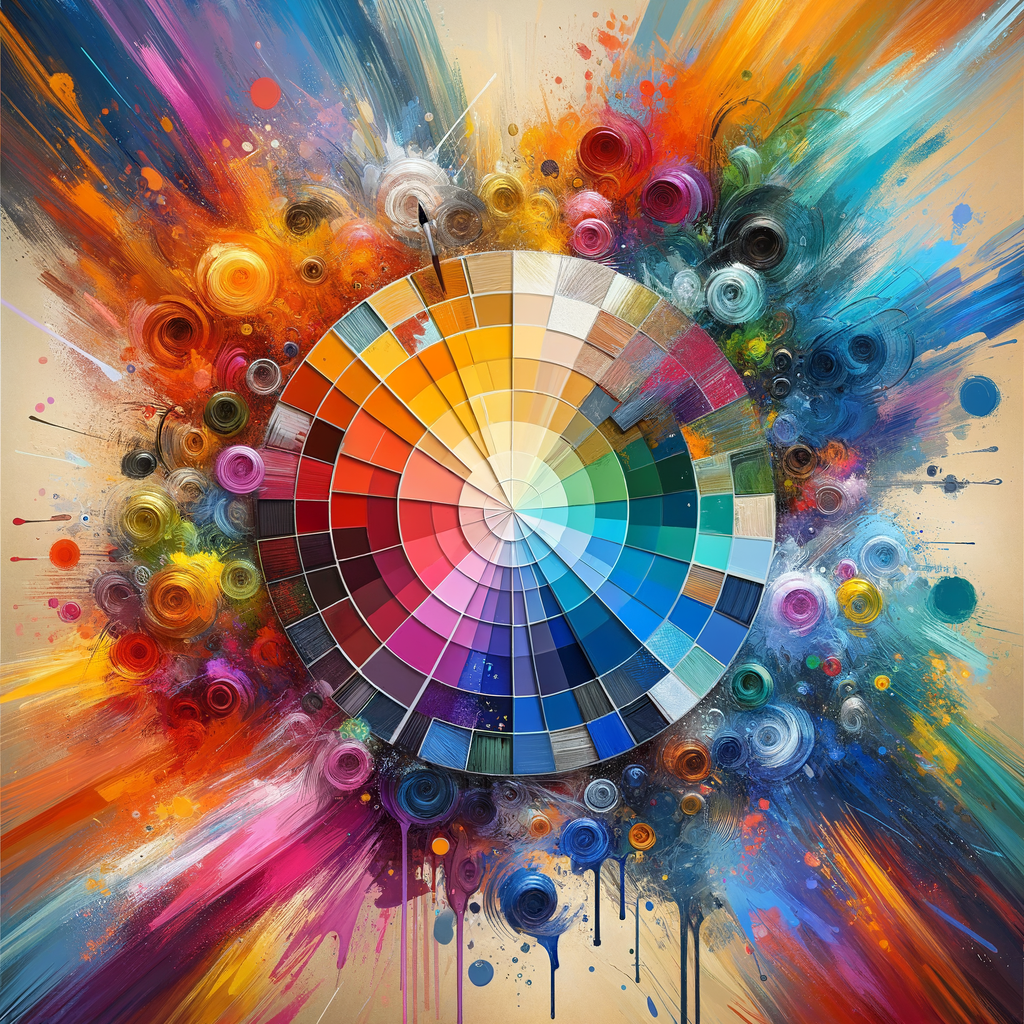
Color is one of the most powerful tools in an artist's arsenal. Understanding color theory not only enhances the aesthetic appeal of your artwork but also conveys emotions and messages effectively. In this exhaustive guide, we will delve deep into color theory principles specifically catered to digital artists. Whether you are a beginner looking to understand the fundamentals or a seasoned professional seeking to polish your skills, you'll find invaluable insights here.
Color theory is an essential foundation for any artist, be it traditional or digital. Understanding how colors interact with each other, the emotional responses they invoke, and how to manipulate them can transform your artwork into visually stunning representations of your ideas. This guide will take you through the intricacies of color theory applicable to digital art.
1. The Basics of Color Theory
Everything begins with the color wheel, a tool that organizes colors into a circular format. The color wheel, developed by Isaac Newton, forms the basis from which most artists understand color theory. It consists of primary, secondary, and tertiary colors. Let's take a closer look:
- Primary Colors: Red, blue, and yellow. These colors cannot be created by mixing other colors together.
- Secondary Colors: Green, orange, and purple. These colors are created by mixing two primary colors.
- Tertiary Colors: These are found by mixing a primary and a secondary color (for example, yellow-green).
The positioning of the colors on the wheel is critical. Colors that are adjacent to each other are called analogous colors, while colors that are opposite each other are referred to as complementary colors. Understanding these relationships helps in creating a harmonious color palette.
2. Understanding Color Harmony
Color harmony refers to aesthetically pleasing arrangements of colors. Here are some popular harmonious schemes:
- Monochromatic: Variations in lightness and saturation of a single color. This creates a serene feeling and can convey a cohesive idea.
- Analogous: Colors that are next to each other on the color wheel. They blend well and are pleasing to the eye.
- Complementary: Colors that are opposite each other on the color wheel. They create strong contrast and can make elements pop.
- Triadic: A scheme that uses three colors that are evenly spaced around the color wheel. This scheme provides a vibrant feel.
Choosing the right color harmony is crucial in setting the mood and tone of your digital artwork.
3. The Psychology of Color
Colors evoke emotions and responses. Understanding the psychology of color can help you communicate more effectively with your audience. Here are some common associations:
- Red: Passion, energy, danger.
- Blue: Calmness, trust, sadness.
- Yellow: Happiness, warmth, caution.
- Green: Nature, growth, tranquility.
- Purple: Luxury, creativity, mystery.
By intentionally selecting colors, you can enhance the narrative of your artwork.
4. Color Mixing Techniques for Digital Artists
In digital art, color mixing is slightly different from traditional methods. Here are some techniques:
- Additive Mixing: Using light colors. For example, combining red and green light results in yellow.
- Subtractive Mixing: Using pigments. Mixing red and yellow paint gives you orange.
- Alpha Blending: Combining colors by adjusting their opacity levels creates a layering effect, which can be manipulated on digital platforms.
Experimenting with these techniques can expand your color repertoire and enable you to create richer artworks.
5. Practical Applications of Color Theory in Digital Art
Now that we understand the fundamental theories and techniques, let’s explore how to apply them in your digital artwork:
- Creating Mood Through Color: Use warm tones for inviting scenes and cool tones for somber settings. This can greatly influence the viewer's perception.
- Highlighting Characters: Assign distinct color palettes to characters to symbolize their traits. For instance, vibrant colors could represent a hero, while dark, muted colors may signify an antagonist.
- Establishing Depth: Utilize color temperature (warm vs. cool) to create depth in your piece. Warmer colors can appear closer, while cooler colors recede into the background.
6. Experimentation and Practice
As with any artistic skill, mastering color theory requires practice. Here are some exercises you can try:
- Create monochromatic artworks using only shades and tints of one color.
- Make studies of famous paintings to analyze the color schemes and their effects.
- Set a timed challenge to create a piece using only a complementary color scheme and see how it influences your work.
Conclusion
Mastering color theory is an ongoing journey for any digital artist. The ability to manipulate color effectively will not only enhance your artwork but also increase the emotional connection viewers have with your pieces. As you continue to explore and challenge yourself with color, remember that the most important thing is to find what resonates with you. Allow your intuition and creativity to take charge while employing the principles of color theory you have learned. Happy painting!

