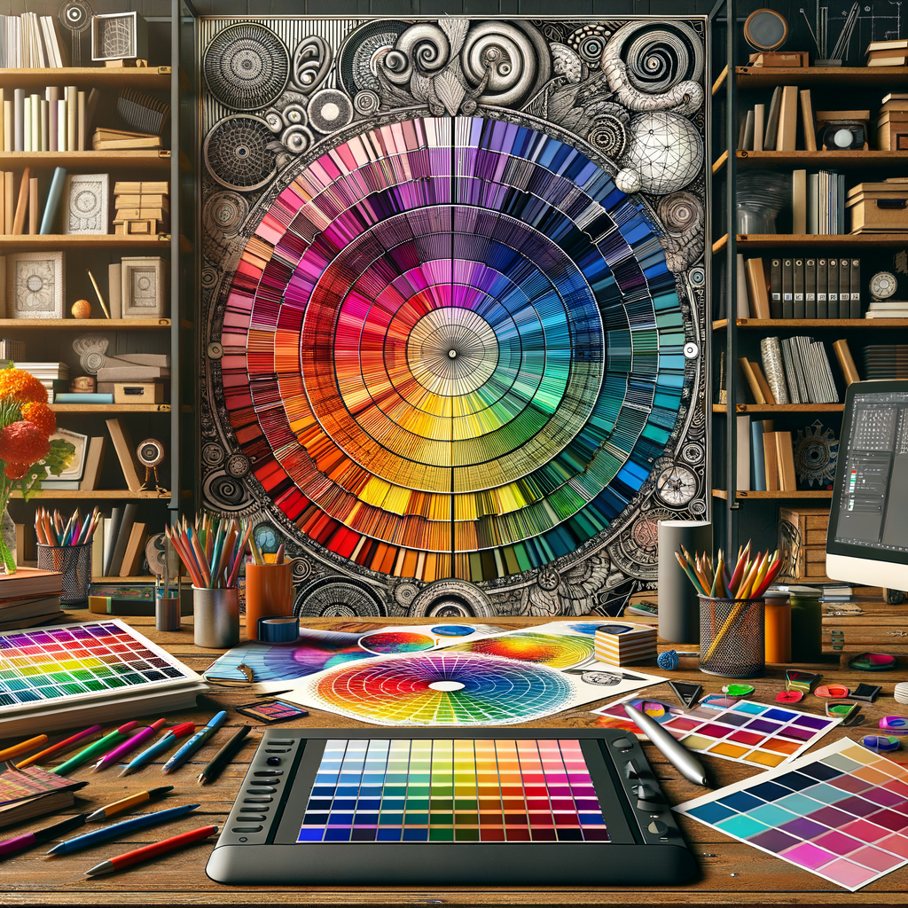
Color is one of the most powerful tools at an artist's disposal. It can evoke emotions, set moods, and create depth in a piece. For digital artists, mastering color theory is essential in creating compelling works that resonate with viewers. This guide delves into the principles of color theory, discusses the psychological effects of color, and provides practical tips for applying these concepts in your digital art.
As a digital artist, one of the first and most crucial skills you need to acquire is an understanding of color. Color theory encompasses a variety of principles that can help you use color effectively to convey emotions and create visual harmony in your artworks.
What is Color Theory?
Color theory is a set of principles used to understand how colors interact with one another. It includes the color wheel, color harmony, and various schemes like complementary, analogous, and triadic color palettes. Understanding these concepts allows artists to make informed choices about the colors they use.
The Color Wheel
The color wheel is an essential tool in color theory. It’s a circular diagram that displays the relationship between colors. The primary colors (red, blue, yellow) form the basis of the wheel. When combined, they create secondary colors (green, orange, purple). Tertiary colors are formed when a primary color and a secondary color are mixed.
By understanding the arrangement of colors on the wheel, artists can choose color combinations that are pleasing to the eye. For instance, colors that are opposite each other on the wheel are called complementary colors, while those next to each other are called analogous colors.
Color Harmony
Color harmony refers to the way colors work together in an artwork. A well-balanced color palette can help create a cohesive piece that captures the viewer’s attention. Here are some common color harmony principles you can use:
- Complementary Color Harmony: Utilize pairs of complementary colors to create contrast and excitement in your artwork.
- Analogous Color Harmony: Use colors that are next to each other on the color wheel for a harmonious and relaxed feeling.
- Triadic Color Harmony: Choose three colors that are evenly spaced around the color wheel for a vibrant and dynamic palette.
The Psychological Effects of Color
Colors can evoke specific emotions and responses from the viewer. For example:
- Red: Associated with passion, energy, and danger.
- Blue: Convey feelings of calmness and trust.
- Yellow: Represents happiness and optimism.
- Green: Symbolizes nature and tranquility.
- Purple: Often linked to creativity and luxury.
In digital art, understanding these associations can help you make more deliberate choices in your color palette, enhancing the emotional impact of your work.
Choosing the Right Color Palette
When creating a digital painting, the color palette plays a pivotal role in the overall feel of the artwork. Here’s how to choose an effective color palette:
- Start by defining the mood or theme of your piece. What emotion do you want to convey?
- Experiment with different palettes using color wheel tools, such as Adobe Color, to visualize color combinations.
- Limit your palette to create unity. Choosing 3-5 main colors can help keep your artwork focused.
As you practice, try to analyze color schemes used in artworks you admire. What colors resonate with you? How do they affect the overall composition?
Applying Color Theory in Digital Art
Understanding and applying color theory in your digital art requires practice and experimentation. Here are some practical steps to integrate these concepts into your work:
- Sketch First: Begin with a sketch of your composition. This allows you to experiment with colors later without altering your design.
- Use Layers Wisely: In digital art programs, use layers for applying color. This way, you can easily adjust hues without affecting the entire piece.
- Play with Opacity: Adjusting the opacity of your color layers can create interesting effects and help blend colors more naturally.
- Seek Feedback: Don’t hesitate to share your work with others and ask for constructive feedback on your color choices.
Common Mistakes to Avoid
Even experienced artists can fall into traps when using color. Here are common mistakes to be aware of:
- Overusing Bright Colors: While bright colors can draw attention, overusing them can result in a chaotic look. Balance bright colors with neutral tones.
- Ignoring Value: Color is not only about hue; the value (lightness or darkness) plays an essential role in visibility and depth.
- Neglecting Color Relationships: Ensure the colors you choose relate to one another. Inconsistent schemes can make a piece feel disjointed.
To avoid these pitfalls, practice and continually refine your understanding of how colors interact. The more you learn, the more intuitive your decisions will become.
Conclusion
Mastering color theory is a journey that will significantly enhance your skills as a digital artist. By understanding how colors work together and how they can be used to evoke emotions, you will improve your artworks and connect more deeply with your audience. Remember to continually experiment with color and seek inspiration from various sources, including nature, media, and the vast world of art.
Embrace your creativity, and let color guide your artistic journey!

