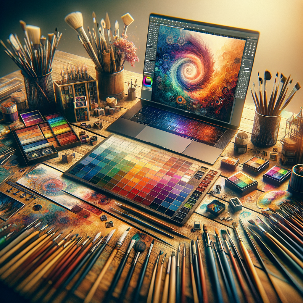
Choosing the right color palette is essential for digital artists seeking to enhance their skills and express their creativity. In this article, we delve deep into color theory, practical tips, and techniques that will elevate your digital artwork. Whether you're a beginner or a seasoned professional, understanding how to effectively use color can be transformative for your artistic journey.
Color is a fundamental aspect of art that can influence emotions, set the tone, and convey messages more than any other element. For digital artists, mastering color can be the key to bringing their artistic visions to life. This article will explore effective strategies for selecting the perfect color palette, understanding color theory, and implementing these concepts in your digital art.
The Basics of Color Theory
Color theory is the foundation of any artist's work, and it encompasses how colors interact with each other and how they can be combined effectively. Understanding the color wheel is crucial for this. The color wheel is a visual representation of colors arranged according to their chromatic relationship. This tool helps artists create harmonious color combinations and understand primary, secondary, and tertiary colors.
1. Primary Colors
The primary colors (red, blue, and yellow) cannot be created by mixing other colors. They are the building blocks for creating other colors and should be utilized as a foundation for any palette.
2. Secondary and Tertiary Colors
Secondary colors are created by mixing two primary colors (green, orange, and purple), while tertiary colors are made by mixing a primary and a secondary color. Familiarizing yourself with these colors can enhance your ability to create more complex palettes.
3. Warm and Cool Colors
Colors can also be categorized as warm (reds, oranges, yellows) and cool (blues, greens, purples). Warm colors tend to evoke feelings of warmth and energy, while cool colors can be calming and soothing. Using a combination of these in your work can create dynamic visual contrasts.
The Psychology of Colors
Understanding color psychology is crucial when selecting a palette. Different colors evoke different emotions and can affect viewers' perceptions. For instance:
- Red can symbolize passion, action, or violence.
- Blue often conveys calmness and trust.
- Yellow is associated with optimism and cheerfulness.
- Green often denotes nature and tranquility.
Choosing a Color Palette
When selecting a color palette for your artwork, consider the following tips:
- 1. Define the Mood: Determine what feeling or atmosphere you want to create. This will guide your color choices.
- 2. Limit Your Palette: Too many colors can lead to visual chaos. Start with a limited palette of 3-5 colors, and you can add more as needed.
- 3. Use Color Harmonies: Color harmonies, such as complementary, analogous, or triadic schemes, can help you create balanced compositions.
Tools for Color Selection
Digital artists have access to various tools and platforms for selecting colors:
- Color Palettes Websites: Sites like Coolors.co or Adobe Color allow artists to generate palettes and explore color combinations.
- Color Pickers in Software: Software like Photoshop and Procreate have built-in color pickers that can help artists select and modify colors effectively.
- Inspiration from Nature: Nature is an endless source of color inspiration. Taking reference photos can help you understand how colors work together in various environments.
Practical Tips for Applying Your Palette
Once you have chosen your palette, applying it effectively is the next step:
- 1. Use Layer Modes: In digital art software, layer blending modes can help you create new colors and effects using your palette.
- 2. Experiment: Don’t be afraid to deviate from your initial choices. Sometimes unexpected combinations yield stunning results.
- 3. Seek Feedback: Sharing your work with fellow artists can provide valuable insights into your color usage and composition.
Conclusion
Choosing the right color palette is an art in itself, but with practice and an understanding of color theory, you can significantly enhance your digital artwork. The journey to mastering color is ongoing, so keep exploring, experimenting, and expanding your knowledge. Your unique voice as an artist will shine through your distinct color choices, drawing viewers in and enriching their experience of your work.

