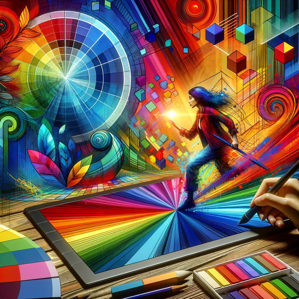
Color is one of the most powerful tools in the arsenal of a digital artist. Understanding color theory is crucial for creating compelling and harmonious artwork. In this extensive guide, we'll delve into the world of colors, covering everything from the basics of the color wheel to advanced techniques for applying color theory in your art. Whether you're a beginner aiming to enhance your skills or an experienced artist seeking new inspiration, this guide will provide valuable insights and practical tips to help you master color theory and elevate your digital paintings.
Color theory is a set of principles used to understand how colors interact with one another. It plays a vital role not just in traditional painting but also in digital art, where the choices you make can drastically affect the mood and effectiveness of your compositions.
Before we dive deeper, let’s explore some of the fundamental concepts of color theory. The first place to start is with the color wheel. The color wheel organizes colors in a circular format, showing the relationships between primary, secondary, and tertiary colors.
Understanding the Color Wheel
The primary colors, red, blue, and yellow, cannot be created by mixing other colors. When combined, they create the secondary colors: green, orange, and purple. Further blending these secondary colors with primary colors leads to tertiary colors, which are more hues created by mixing primary and secondary colors.
Color Harmonies
Color harmonies are arrangements of colors that create a visually pleasing effect. There are several types of color harmonies that you can use to enhance your digital art:
- Complementary Colors: These are colors directly opposite each other on the color wheel. For example, blue and orange. This harmony creates high contrast and vibrant looks, often used to make elements stand out.
- Analogous Colors: These are colors next to each other on the wheel, like red, red-orange, and orange. This harmony is pleasing to the eye and works well for creating serene and comfortable designs.
- Triadic Colors: This scheme uses three colors evenly spaced on the wheel. For example, red, yellow, and blue can create a vibrant and colorful piece when implemented properly.
The Psychological Impact of Color
Colors have psychological effects on viewers. Warm colors, such as red and yellow, evoke feelings of warmth and energy, while cool colors like blue and green bring calmness and serenity. Understanding the emotional implications of colors can aid in conveying the intended message and mood of your artwork.
Creating a Color Palette
Now that we have a basic understanding of colors, let's discuss how to create effective color palettes. Here are some tips:
- Define Your Mood: Decide on the emotion you want to evoke in your artwork. Choosing a mood will guide your color choices.
- Limit Your Palette: While it may be tempting to use many colors, limiting your palette to three to five main colors keeps the artwork cohesive.
- Use Color Swatches: Make color swatches for quick reference. This can be done digitally using software or physically with paint samples.
- Experiment: Don’t be afraid to experiment! Mixing different colors can lead to unexpected and exciting results.
Application Techniques
Once you’ve chosen your colors, the next step is applying them effectively in your digital artworks. Below are techniques to consider:
- Layering: Layer your colors to create depth. Build from the darkest hues to the lightest, allowing colors to blend naturally.
- Texture: Use texture to enhance your colors. Techniques such as brush strokes, overlays, and patterns can add richness to your work.
- Lighting: Consider how lighting affects color. The direction and quality of light can transform how colors appear.
Conclusion
Mastering color theory can significantly improve your digital artworks. By understanding how colors work together, creating effective palettes, and applying those colors thoughtfully, your art can resonate more deeply with viewers. Continue to explore and experiment with color; it is a journey that will continually enrich your artistic practice.

