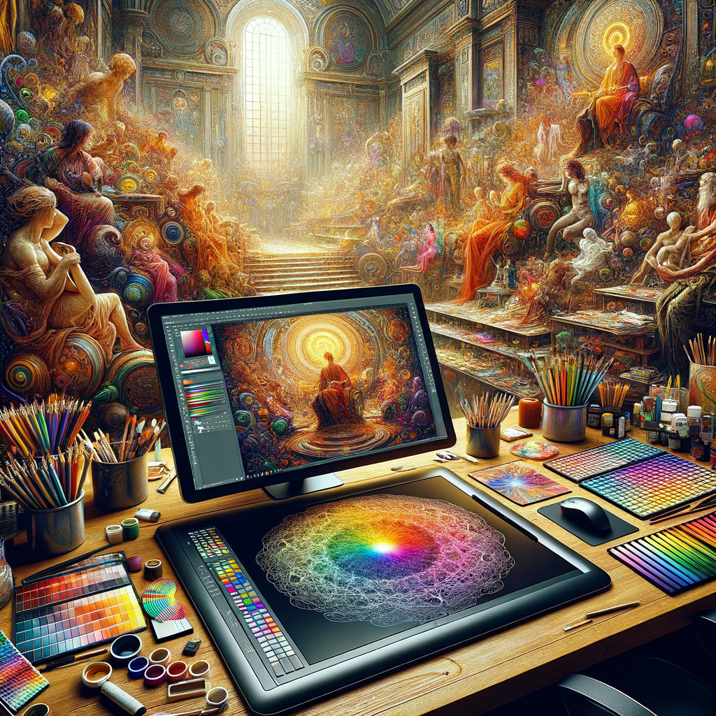
Color is one of the fundamental elements of visual arts that can evoke emotions, create depth, and enhance the overall impact of a piece. For digital artists, understanding color theory is crucial for creating compelling artworks. In this article, we will delve into the intricacies of color, discuss various techniques for effective color selection, and share tips to improve your skills in using color to enhance your art.
Learning color theory opens up a world of possibilities for any digital artist. From choosing the right color palette to understanding the psychological effects of color, mastering these concepts will not only elevate your artwork but also give you the confidence to explore your creative potential fully.
One of the first things to understand about color theory is the color wheel, a tool that helps visualize how colors relate to one another. The color wheel is typically divided into primary colors (red, blue, yellow), secondary colors (green, orange, purple), and tertiary colors created by mixing primary and secondary colors.
By understanding the relationships between these colors, you can begin to create harmonious color palettes for your pieces. Color harmony involves using colors that look pleasing together. This can be achieved through various methods, such as complementary, analogous, and triadic color schemes.
1. **Complementary Colors**: These are colors that are opposite each other on the color wheel. For instance, blue and orange are complementary colors. When placed next to each other, they create contrast, making each other appear more vibrant. This technique is particularly useful for drawing attention to specific elements within your artwork.
2. **Analogous Colors**: These are colors that are next to each other on the color wheel. For example, blue, blue-green, and green form an analogous color scheme. This type of palette tends to create a serene and comfortable design, making it perfect for themes that require a softer approach.
3. **Triadic Colors**: This scheme involves using three colors that are evenly spaced around the color wheel. For instance, red, yellow, and blue create a bold and vibrant composition. Triadic schemes are excellent for creating lively and dynamic artworks, but they require careful balance to avoid overwhelming the viewer.
Besides understanding color harmony, it's essential to grasp the emotional impact of colors. Colors can communicate feelings and set the tone of an artwork. For instance, warm colors like red and yellow can evoke feelings of warmth and energy, while cool colors like blue and green can convey calmness and tranquility.
As a digital artist, experiment with different color palettes and observe how they affect the mood of your artwork. For instance, if you're painting a landscape, consider using a warm palette during sunrise or sunset to evoke emotions of warmth and nostalgia, while cooler tones may be more appropriate for a winter scene.
Another vital aspect of color theory is understanding saturation and brightness. Saturation refers to the intensity of a color, while brightness refers to the lightness or darkness of a color. Manipulating these aspects can add depth to your artwork. High saturation can draw attention, while lower saturation can create subtlety.
Additionally, don't hesitate to break traditional rules. Art is about expression, and some of the most stunning works have come from artists who dared to experiment with unconventional color choices. Use color not just as a tool but as a means of storytelling in your work.
Getting Started with Color Palettes
To create an effective color palette, start by choosing a base color that aligns with your artistic vision for the piece. From there, you can select additional colors based on the harmony methods previously discussed. A practical approach is to create several color swatches and test them out in your artwork before making final decisions.
Software tools like Adobe Photoshop, Procreate, and others often come with built-in tools to help you create color palettes. You can use these tools to sample colors, adjust saturation and brightness, and see how different colors interact with each other on your canvas.
Furthermore, many digital artists utilize resources like Adobe Color (formerly Kuler) to explore professional-grade color palettes. You can view trending palettes or create your custom palettes and share them with the artist community for feedback and inspiration.
Color in Practice: Tips and Techniques
Now that we've established the fundamentals of color theory, let's move on to practical tips and techniques that can enhance your color usage:
- **Study Color Mixes**: When working with colors, take time to mix colors physically (if using traditional mediums) or digitally to understand how they interact. This will aid in developing your intuition around color choices.
- **Analyze Other Artists**: Look at the works of other artists, both contemporary and classical. Pay attention to their color choices and palettes, and analyze why they work well. You can take inspiration from their techniques to refine your approach to color in your own work.
- **Limit Your Palette**: Sometimes, using fewer colors can create a stronger impact. By limiting your color palette, you can create more cohesive artwork that feels intentional rather than chaotic.
- **Practice Color Studies**: Spend time creating small pieces focused solely on exploring color. This practice can help improve your skills without the pressure of completing a full artwork.
- **Seek Feedback**: Engage with other artists or online communities to gain feedback on your color choices. Constructive criticism can help you grow as an artist and develop your understanding of color.
By mastering color theory and applying these strategies, you will realize the incredible potential of color in elevating your artworks. Whether you are a beginner or a seasoned artist, the journey of exploring color is continuous and ever-evolving.
As you continue to paint and create, remember that color is a personal language. With practice and experimentation, you'll discover how to express yourself more authentically through the palette you choose. Happy painting!

