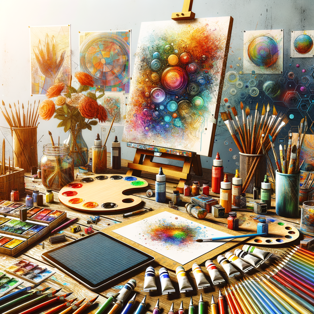
Color is at the heart of every artwork, playing a vital role in how viewers perceive and connect with a piece. For digital artists, mastering color theory is essential to create impactful and visually stunning works. In this comprehensive guide, we will explore key concepts of color theory, practical techniques for mixing colors, and tips for developing a cohesive color palette that resonates with your audience. Whether you are a beginner, an intermediate artist, or a seasoned professional, understanding the intricacies of color can significantly elevate your artistic skills.
Color theory is a complex topic that encompasses the principles of how colors interact, their emotional effects, and their applications in art. It is crucial for artists to develop a strong understanding of these concepts to effectively communicate their ideas through their use of color. This article aims to provide an in-depth look at the various elements of color theory, helping artists at all levels to refine their skills and enhance their artworks.
1. The Color Wheel
The foundation of color theory lies in the color wheel, a visual representation of colors arranged according to their chromatic relationship. The primary colors (red, blue, yellow) are spaced evenly around the wheel, and from these, secondary (green, orange, purple) and tertiary colors (red-orange, yellow-green, etc.) are created by mixing primary and secondary colors.
Understanding the color wheel allows artists to develop a sense of color relationships such as complementary, analogous, and triadic colors. These relationships can guide artists in creating dynamic compositions.
2. Color Harmony
Color harmony refers to the pleasing arrangement of colors that create a sense of balance in an artwork. There are several types of color harmony that can be utilized:
- Complementary Harmony: This involves using colors that are opposite each other on the color wheel. For example, blue and orange create a striking contrast when paired together.
- Analogous Harmony: This color scheme consists of colors that are next to each other on the color wheel, such as yellow, yellow-green, and green, providing a serene and harmonious look.
- Triadic Harmony: In this scheme, three colors that are evenly spaced around the color wheel are used, such as red, yellow, and blue, allowing for vibrant, lively compositions.
3. The Emotional Impact of Color
Colors are capable of evoking a wide range of emotions. Understanding how different colors affect viewers' perceptions can help artists convey the desired mood in their work. For instance:
- Red: Often associated with passion, love, and excitement.
- Blue: Conveys calmness, stability, and tranquility.
- Yellow: Associated with happiness, energy, and warmth.
By intentionally selecting colors based on their emotional impact, artists can enhance their storytelling and engage viewers more deeply.
4. Color Mixing Techniques
Mixing colors accurately is a crucial skill for digital artists. Here are some techniques to achieve the desired shades:
- RGB vs. CMYK: Understand the difference between the RGB (Red, Green, Blue) color model used for digital screens and CMYK (Cyan, Magenta, Yellow, Black) used in print, as they have different capabilities and outcomes.
- Using Opacity: Adjusting the opacity of layers can create various effects by allowing underlying colors to blend, which can lead to rich and complex color combinations.
- Experimentation: Don’t hesitate to experiment with different mixing techniques; create swatches and record your experiments to build an effective color reference library.
5. Creating a Cohesive Color Palette
A well-thought-out color palette can unify an artwork, making it more visually appealing. Here are steps to create a cohesive color palette:
- Choose a Dominant Color: Select a primary color that will carry the overall theme of your artwork.
- Complementary Colors: Find and incorporate complementary colors to enhance contrast and visual interest.
- Limit Your Palette: Using too many colors can lead to chaos; limiting your palette can create harmony and focus.
6. Practice Makes Perfect
Color theory is vast, and the best way to master it is through practice. Regularly challenge yourself by creating new pieces with different color palettes. Analyze your favorite artworks and study how the artists used color to enhance their compositions. Engage in exercises that allow you to focus solely on color, such as creating monochromatic works or limiting your palette.
7. Resources for Further Learning
There are numerous resources available for artists who wish to deepen their understanding of color theory:
- Books on color theory and art fundamentals.
- Online courses and tutorials that provide practical exercises.
- Color wheel tools and mobile apps that assist in generating color palettes.
- Art communities and forums where artists share their experiences and techniques.
In conclusion, mastering color theory is an essential skill for digital artists. By understanding the color wheel, developing a sense of harmony, recognizing emotional impacts, and continually practicing, artists can significantly enhance their artworks. Embrace the journey, and let color become a vital aspect of your artistic expression.

