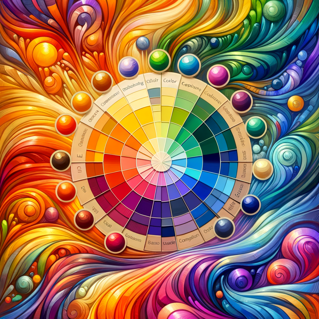
Color is one of the most critical elements in any form of visual art. In digital art, understanding color theory can significantly enhance the quality of your work and help you convey emotions more effectively. This guide is designed for artists of all levels who want to master the art of color selection and palette creation in digital painting. We will delve into the principles of color theory, provide practical tips, and share examples to inspire you in your artistic journey.
Color theory is a vast and intricate subject, but when broken down into its fundamental components, it becomes much more manageable. At its core, color theory is the study of how colors interact with one another and how they can be combined to create visually appealing artworks. To master digital color theory, artists must first familiarize themselves with some essential concepts.
1. The Color Wheel
The color wheel is a crucial tool in understanding color relationships. It comprises primary, secondary, and tertiary colors. The primary colors — red, blue, and yellow — cannot be created by mixing other colors. Secondary colors are formed by mixing primary colors (purple, green, and orange), while tertiary colors are obtained by mixing primary and secondary colors together.
2. Color Harmony
Color harmony refers to the pleasing arrangement of colors. Artists can use various schemes to achieve harmony in their work, such as complementary, analogous, and triadic color schemes:
- Complementary colors are pairs of colors that are opposite each other on the color wheel (e.g., red and green). When used together, they create strong contrasts and vibrancy.
- Analogous colors are colors that are next to each other on the color wheel (e.g., blue, blue-green, and green). They create a serene and comfortable feel in artwork.
- Triadic colors are three colors that are evenly spaced around the color wheel (e.g., red, yellow, and blue). This scheme offers a balanced and vibrant palette.
3. Color Temperature
Colors also have temperatures, categorized as warm or cool. Warm colors (reds, oranges, yellows) tend to evoke energy and excitement, while cool colors (blues, greens, purples) can evoke calmness and serenity. Being mindful of color temperature is crucial when you're trying to convey specific emotions or moods in your art.
4. The Psychology of Color
Different colors can evoke various feelings and associations. For instance, red may signify passion or danger, while blue can represent tranquility or sadness. As an artist, using color psychology can help you convey a message or emotion effectively. It’s essential to consider the cultural context of colors since meanings can vary across different societies.
5. Color Context
The way colors appear can change dramatically depending on their surrounding colors. This phenomenon is known as color context. For instance, a color might look different when placed against a contrasting background. Therefore, it is crucial to experiment with color combinations and see how they interact in your artwork.
Practical Applications of Color Theory in Digital Art
Understanding color theory is only part of the journey. Here are some practical tips for applying these concepts in your digital artwork:
- Start by creating a color palette before you begin painting. Many digital art programs, such as Photoshop or Procreate, allow you to save color swatches for quick access.
- Use overlays and adjustment layers to explore how different colors interact with your work.
- Experiment with different color schemes for the same artwork to see which combinations resonate best.
- Analyze your favorite artworks to determine how color theory is applied, focusing on harmony, temperature, and context.
Creating a Color Palette
Creating a cohesive color palette is essential for successful digital paintings. Here are some steps to guide you:
- Identify the mood and subject of your artwork. This will influence your color choices significantly.
- Use the color wheel to select a harmonious color scheme.
- Choose one primary color as the dominant hue and build around it using complementary or analogous colors.
- Limit your palette to a specific number of colors to avoid overwhelming your composition.
- Test your palette by creating small sketches or color studies to see how the colors interact before finalizing your choices.
Conclusion
Mastering color theory is essential for any digital artist looking to enhance their skills and create visually stunning artworks. By understanding the principles of color, experimenting with different palettes, and applying these concepts in your work, you will be well on your way to achieving a high level of proficiency in digital painting. Remember, practice is key — the more you paint, the better you’ll become at using color to express your artistic vision.

