
Color plays a crucial role in every piece of art. Understanding color theory is essential for digital artists who wish to convey emotions, create visual interest, and enhance the overall impact of their work. This comprehensive guide will take you through the principles of color theory, providing practical tips and techniques to effectively apply these concepts in your digital artworks.
What is Color Theory?
Color theory is a set of principles used to understand how colors interact with one another and the effects they have when combined. It serves as a crucial foundation for artists, designers, and anyone working with color in visual mediums. The theory is built upon three primary components: the color wheel, color harmony, and the psychological effects of color.
The Color Wheel
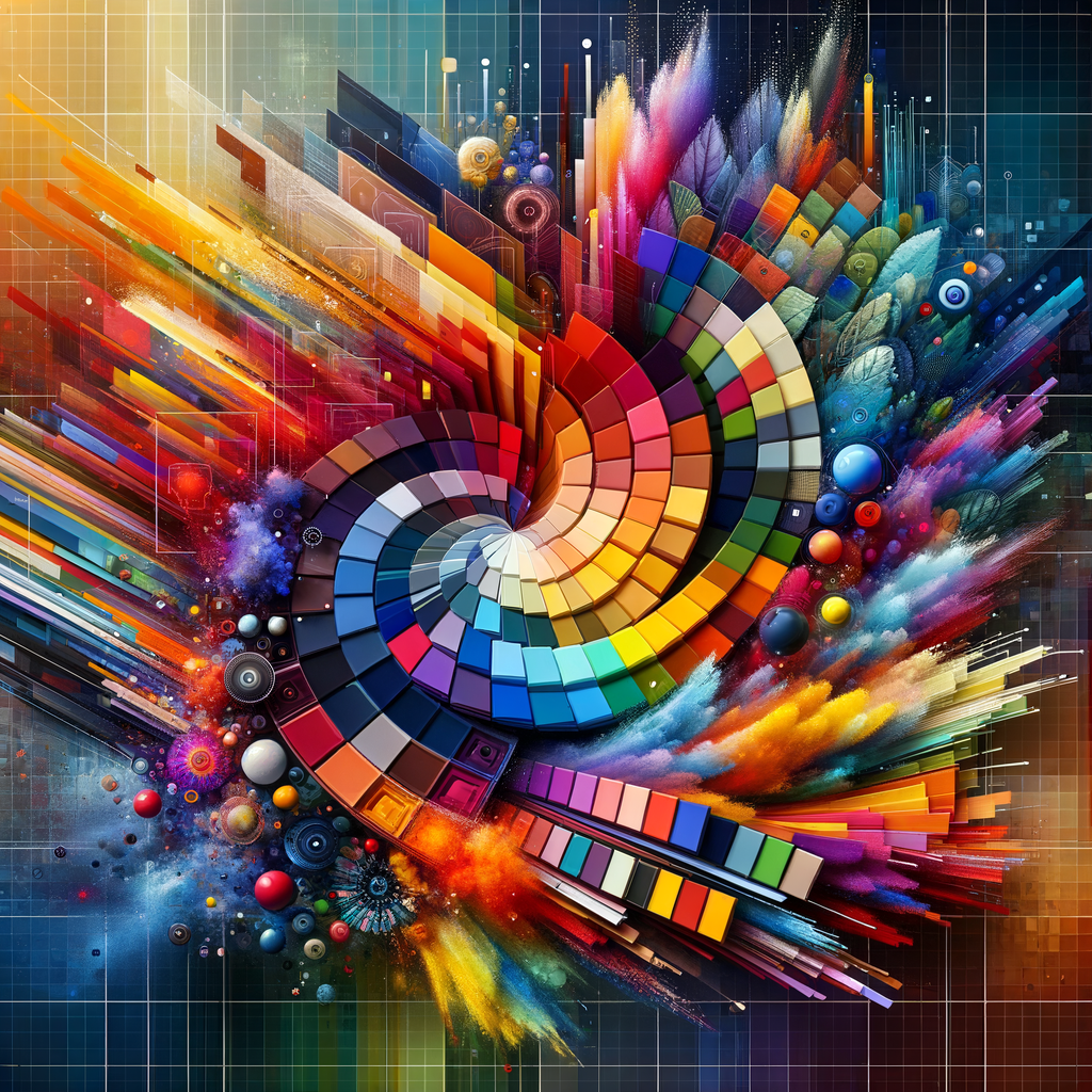
At the heart of color theory is the color wheel, a circular diagram that organizes colors based on their relationships. The traditional color wheel is divided into 12 segments, including the three primary colors (red, blue, yellow), three secondary colors (green, orange, purple), and six tertiary colors (such as red-orange and blue-green). Understanding the color wheel allows artists to see how colors mix, relate, and contrast with one another.
Primary, Secondary, and Tertiary Colors
Primary colors cannot be created by mixing other colors and serve as the building blocks for all other colors. Secondary colors result from mixing two primary colors, while tertiary colors are formed by mixing a primary color with a secondary one. This hierarchical structure helps artists create a wide range of hues and tones.
Color Harmony
Color harmony refers to the aesthetically pleasing arrangement of colors in a composition. By utilizing different color schemes—such as complementary, analogous, and triadic colors—artists can create a sense of balance and cohesion within their artwork.
1. **Complementary Colors**: Colors that are opposite each other on the color wheel, such as blue and orange, create a striking contrast. They tend to enhance each other when placed side by side.
2. **Analogous Colors**: These colors are next to each other on the color wheel, like blue, blue-green, and green. They create a serene and harmonious look when used together.
3. **Triadic Colors**: This scheme utilizes three colors that are evenly spaced around the color wheel. For example, red, yellow, and blue create a vibrant contrast while maintaining balance.
The Psychological Effects of Color
Colors evoke emotions and can significantly influence how viewers perceive a piece of art. For example, warm colors like red and yellow can create a sense of energy and excitement, while cool colors such as blue and green are often associated with calmness and tranquility. Understanding these psychological effects allows digital artists to choose colors strategically to evoke the desired emotional response from their audience.
Creating Effective Color Palettes
A color palette is a selection of colors that an artist chooses to use in their artwork. Crafting a cohesive and effective palette involves considering the mood, message, and style of the piece. Here are some tips to help you develop your own color palettes:
1. **Start with a Base Color**: Choose a single color that resonates with the theme of your artwork. This color will serve as the foundation for your palette.
2. **Use a Color Picker Tool**: Many digital art software applications include color picker tools that can help you select and save colors as you create your artwork.
3. **Experiment with Color Variations**: Don’t be afraid to adjust the saturation and brightness of your chosen colors. This experimentation will help you discover unique combinations that work well together.
4. **Limit Your Palette**: Select 3 to 5 key colors to avoid overwhelming your composition. A limited palette often results in a more harmonious and focused piece.
Color Mixing Techniques
Color mixing is the process of combining different colors to create new hues. There are several methods for mixing colors, including:
1. **Subtractive Mixing**: This method refers to mixing pigments or paints. For instance, when you mix yellow and blue pigments, you get green. Be mindful of the types of pigments you use, as different media can yield different results.
2. **Additive Mixing**: This technique applies to light sources. For example, when red, green, and blue light overlap, they create white light. Digital artists often use this concept when working on screens.
Tools and Resources for Color Theory
Many digital tools can assist artists in applying color theory principles to their work. Some popular digital tools and resources include:
1. **Adobe Color**: This online tool allows artists to create color schemes and explore existing palettes made by the community.
2. **Coolors.co**: A color scheme generator that helps you create and save your palettes quickly and efficiently.
3. **Color Hunt**: A curated collection of beautiful color palettes that artists can use for inspiration.
Conclusion
Understanding color theory is essential for digital artists looking to enhance their work and communicate emotions effectively. By mastering the color wheel, exploring color harmony, considering the psychological effects of colors, and developing your own color palettes, you can create visually stunning and impactful digital artwork. Remember, the world of color is vast and ever-evolving, so continue to experiment and push the boundaries of your creativity.