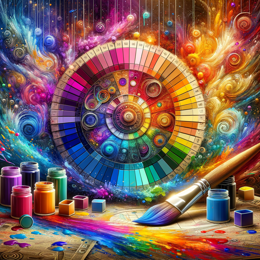
Color theory is a crucial aspect of creating captivating digital art. Whether you're a beginner or an experienced artist, understanding how colors interact can dramatically enhance your work. In this comprehensive guide, we will explore the principles of color theory, provide practical tips for color mixing, and delve into how you can select the perfect color palette for your projects. Let's embark on a colorful journey that will elevate your digital paintings to new heights!
Color is one of the most powerful tools available to artists. It can evoke emotion, create depth, and bring a sense of life and energy to an artwork. By mastering color theory, you can harness this power and apply it effectively in your digital art.
In this guide, we will cover:
- The basics of color theory.
- The color wheel and its importance.
- The role of primary, secondary, and tertiary colors.
- Complementary, analogous, and triadic color schemes.
- Color temperature: warm vs. cool colors.
- Creating a harmonious color palette for your artwork.
- Practical steps for mixing colors digitally.
- Common mistakes in color usage and how to avoid them.
- Analyzing successful artworks to understand color choices.
The Basics of Color Theory
Color theory is built upon the understanding of how colors work together. At its core, it studies how we perceive colors and how they interact with one another. The color wheel is a vital tool in color theory, providing a visual representation of colors and their relationships.
The Color Wheel and Its Importance
The color wheel consists of twelve colors, including three primary colors (red, blue, yellow), three secondary colors (green, orange, purple), and six tertiary colors (yellow-green, blue-green, blue-purple, red-purple, red-orange, yellow-orange). Understanding the color wheel allows artists to mix colors effectively and create cohesive color schemes.
The Role of Primary, Secondary, and Tertiary Colors
Primary colors cannot be created by mixing other colors. They serve as the foundation for all other colors in the color wheel. Secondary colors are formed by mixing two primary colors, while tertiary colors are created by mixing a primary color with a secondary color. Mastery of these basic color relationships is crucial for any digital artist.
Complementary, Analogous, and Triadic Color Schemes
Color schemes are methods of selecting colors for a design or artwork. Complementary colors are located opposite each other on the color wheel and create high contrast, making them effective for drawing attention. Analogous colors are next to each other on the wheel and create harmony and cohesion, while triadic schemes use three equally spaced colors, adding vibrancy to your piece. Understanding these schemes will help you create visually appealing compositions.
Color Temperature: Warm vs. Cool Colors
Colors are also classified by temperature. Warm colors (reds, oranges, yellows) evoke feelings of warmth and energy, while cool colors (blues, greens, purples) convey calmness and serenity. Your choice of color temperature can set the mood and atmosphere of your artwork.
Creating a Harmonious Color Palette for Your Artwork
Choosing the right color palette is crucial for the overall cohesiveness of your artwork. Start by selecting a dominant color, then use the color wheel to identify complementary and analogous colors that will enhance your main color. Consider the emotions you want to evoke and the story you wish to tell through your color choices.
Practical Steps for Mixing Colors Digitally
Digital painting software often includes tools for color mixing. Begin by selecting your base color and adjust the hue, saturation, and brightness to create the desired shades. Experiment with different combinations and rely on your color wheel for guidance. Use layers in your software to test colors without affecting your main work.
Common Mistakes in Color Usage and How to Avoid Them
Even experienced artists can make mistakes with color. Some common pitfalls include using too many colors, not paying attention to color harmony, and neglecting the effects of light and shadow. Always step back and evaluate your work, ensuring that your colors complement each other and convey the desired mood.
Analyzing Successful Artworks to Understand Color Choices
One of the best ways to improve your color skills is by studying successful artworks. Analyze how artists use color to create depth, mood, and movement. Take notes on color choices, schemes, and how different colors interact. This practice will enhance your understanding of color theory and inspire your personal style.
Conclusion
Mastering color theory is essential for any digital artist looking to elevate their work. By understanding color relationships, creating harmonious palettes, and avoiding common mistakes, you can breathe life into your digital paintings and communicate your artistic vision effectively. Remember to practice, experiment, and draw inspiration from the world around you as you develop your unique approach to color!

