
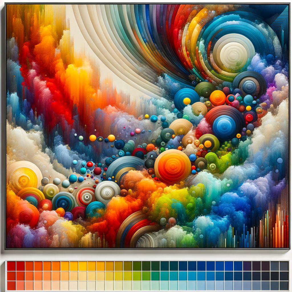
Color is one of the most powerful tools in an artist's arsenal. For digital artists, understanding color theory is essential not only for creating aesthetically pleasing works but also for conveying emotions and messages effectively. This guide will delve into the fundamentals of color theory, its applications in digital art, and practical tips to help you choose and mix colors like a pro. Whether you are a beginner or a seasoned artist, mastering color theory can significantly elevate your artwork and artistic vision.
Understanding Color Theory
Color theory is a set of principles used to understand how colors interact with each other. It encompasses aspects such as the color wheel, color harmony, and color context, which are all critical for creating visually appealing compositions. At its core, color theory seeks to explain how colors can be mixed, their relationships, and their emotional effects on viewers.
The Color Wheel
The color wheel is one of the foundation stones of color theory. It illustrates the relationships between primary, secondary, and tertiary colors:
- Primary Colors: Red, Blue, and Yellow. These colors cannot be created by mixing other colors.
- Secondary Colors: Green, Orange, and Purple. These colors are formed by mixing two primary colors.
- Tertiary Colors: Colors like Red-Orange or Yellow-Green formed by mixing a primary and a secondary color.
Understanding these relationships lays the groundwork for exploring more complex color interactions and combinations.
Color Harmony
Color harmony refers to aesthetically pleasing color combinations. There are several color schemes that artists can use to create harmony in their artwork:
- Complementary: Colors opposite each other on the color wheel. For example, red and green. This scheme has high contrast and can be very striking.
- Analogous: Colors that are next to each other on the color wheel, like blue, blue-green, and green. They typically match well and create serene and comfortable designs.
- Triadic: A color scheme involving three colors that are evenly spaced around the color wheel. An example would be purple, green, and orange, providing both contrast and harmony.
By using these schemes, artists can ensure their works resonate with viewers on a visual level.
Color Context
The meaning and perception of a color can change depending on the colors surrounding it. Color context is crucial in digital art because it affects the work's mood, depth, and overall impact.
For example, a bright yellow looks different next to a deep blue than it does against white. Artists must be conscious of these relationships and how they can manipulate colors to achieve desired effects.
Choosing a Color Palette
When starting a new piece, deciding on a color palette can feel overwhelming. Here are some tips to help artists select a suitable color palette:
- Limit Your Palette: Start with three to five colors. This helps create cohesion in your artwork and keeps it from becoming chaotic.
- Explore Color Palettes: Use tools and websites like Adobe Color or Coolors to experiment with different palettes and see what resonates with the theme of your artwork.
- Paint a Color Study: Before diving into your final piece, create a small color study to visualize how your chosen colors interact with each other.
Understanding Color Temperature
Colors can be categorized as warm or cool, affecting the mood of your artwork:
- Warm Colors: Reds, oranges, and yellows. They tend to evoke feelings of warmth, excitement, and energy.
- Cool Colors: Blues, greens, and purples. These colors generally create a sense of calm and tranquility.
Incorporating both warm and cool colors can add depth and dimension to digital paintings.
Color Mixing Techniques
When working digitally, artists have access to a vast array of colors at their fingertips. Here are some effective color mixing techniques:
- Layering: Use layering to build up colors gradually. Start with a base color and layer on additional colors to create depth and variety.
- Opacity and Blending Modes: Experiment with the opacity of your brush and different blending modes to produce unique effects when mixing colors.
- Custom Brushes: Utilize custom brushes to help create varying textures and effects when applying colors.
By practicing these techniques, artists can achieve a more nuanced approach to color in their digital artworks.
Common Mistakes to Avoid
Even experienced artists can fall into common pitfalls regarding color use. Here are a few mistakes to watch for:
- Overusing Saturated Colors: While bright colors can grab attention, excessive saturation can overwhelm viewers. Balance saturated hues with neutral or muted colors.
- Neglecting Lighting: Lighting plays a crucial role in how colors are perceived. Failing to consider lighting can lead to unrealistic color choices.
- Ignoring Color Theory: Relying solely on instinct without considering color theory can lead to unbalanced compositions. Take the time to study and apply color principles thoughtfully.
Applying Color Theory to Character Design
Color theory is particularly important in character design, where color choices can reflect personality traits and emotional states:
- Character Personality: Choose colors that align with your character's traits. For example, warm colors can indicate friendliness, while cool colors may suggest aloofness.
- Character Relationships: Using color to depict relationships between characters can enhance storytelling. Consider using complementary colors for opposing characters and analogous colors for allies.
Being intentional with color in character design can help convey complex narratives through visual means.
Inspiration and Practice
As you continue learning about color theory, it is essential to seek inspiration from other artists and practice your skills:
- Study Masterpieces: Analyze how famous artists use color in their works. Try replicating their color palettes to gain insights into their methods.
- Daily Color Exercises: Set aside time each day to experiment with color mixing and palettes. Create small sketches or color studies to keep developing your understanding.
- Join Online Communities: Participate in online forums and social media groups to share your work and gain feedback on your use of color.
Conclusion
Mastering color theory is a continuous journey for any digital artist. By understanding the relationships between colors, the principles of color harmony, and how to apply these concepts, you can take your artworks to the next level. Remember that practice is key—experiment, make mistakes, and learn from them. With dedication and a keen eye for color, you will see a significant improvement in your digital artwork.