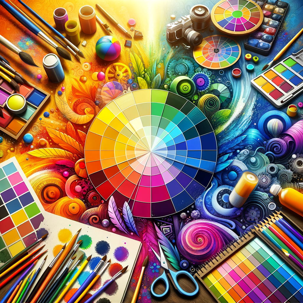
Color plays a crucial role in art, especially in digital mediums where artists have limitless possibilities at their fingertips. Understanding color theory is essential for creating visually appealing and emotionally resonant artworks. In this comprehensive guide, we will explore the fundamental principles of color theory, how to choose the right palette for your projects, and effective techniques for applying color in your digital creations. Whether you're a beginner or a seasoned artist, mastering color can elevate your artwork to new heights.
Color theory is a set of principles used to understand how colors interact with each other and how they can be combined to create desired effects. It encompasses a variety of elements, including the color wheel, color relationships, and the psychological impact of colors on viewers.
In this article, we will break down these components and provide practical examples and exercises to help you better grasp the concept of color theory. We'll also delve into how different colors evoke different emotions and how you can use this knowledge to enhance your storytelling through art.
Understanding the Color Wheel
The color wheel is a circular diagram that organizes colors in a wheel format, showcasing the relationships between primary, secondary, and tertiary colors. The primary colors are red, blue, and yellow, which cannot be created by mixing other colors. When you mix these colors together, you get secondary colors: orange (red + yellow), green (blue + yellow), and purple (red + blue). Tertiary colors are obtained by mixing a primary color with a secondary color, resulting in hues like red-orange, yellow-green, and blue-purple.
Familiarizing yourself with the color wheel is crucial for understanding color relationships, which include:
- Complementary Colors: Colors that are opposite each other on the color wheel. For example, red and green are complementary. When used together, they create high contrast and can make each other appear more vibrant.
- Analogous Colors: Colors that are next to each other on the color wheel. For example, blue, blue-green, and green create a serene and harmonious look when used together.
- Triadic Colors: Colors that are evenly spaced around the color wheel, such as red, yellow, and blue. This combination creates a vibrant and lively palette.
The Psychology of Color
Colors can evoke specific feelings and associations, making them powerful tools for artists. Understanding the psychological impact of colors can help in creating specific moods in your artworks. For instance:
- Red: Associated with energy, passion, and urgency. It can create a sense of excitement or intensity.
- Blue: Represents calmness, trust, and serenity. It's often used to convey peace and stability.
- Yellow: Associated with happiness, optimism, and creativity. It can add a cheerful vibe to your artwork.
- Green: Represents growth, health, and tranquility. It's often used to depict nature and harmony.
- Purple: Associated with luxury, mystery, and creativity. It can add a sense of elegance and depth to your pieces.
Choosing the Right Color Palette
Once you've grasped the basics of color theory, it's essential to choose the right color palette for your artwork. A well-chosen palette can profoundly affect the overall impact of your piece. Experimenting with different color palettes can yield stunning results. Here are some tips for selecting your color palette:
- Start with Inspiration: Look at your favorite artworks, nature, or even fashion trends for inspiration. Notice the color combinations that stand out to you and consider how you can incorporate them into your art.
- Limit Your Palette: Sometimes less is more. Limiting your color palette can lead to more cohesive and focused artworks. Aim for a palette of 3-5 main colors and a couple of accent colors.
- Test Different Combinations: Don’t hesitate to experiment. Use digital tools to test out different color combinations and see how they work together before committing to a palette.
Applying Color Techniques in Digital Art
Now that you understand the basics of color theory and how to choose the right palette, it’s time to apply this knowledge to your digital artworks. Here are some techniques to consider:
- Layering and Blending: Digital art allows for unique layering techniques that can enhance the depth and richness of your colors. Experiment with opacity, blending modes, and layer styles to achieve stunning results.
- Light and Shadow: Understanding the impact of light on color is crucial. Use highlights and shadows effectively to create a sense of three-dimensionality and realism in your artwork.
- Color Grading: After finishing your piece, consider using color grading techniques to unify the color scheme and create a specific mood. This can involve adjusting the overall color balance, saturation, and contrast of your artwork.
Exercises to Improve Your Color Skills
The best way to master color theory is through practice. Here are some exercises that can help you strengthen your color skills:
- Create a Color Wheel: Spend some time creating your own color wheel using paint or digital tools. This will help reinforce your understanding of color relationships.
- Study Existing Artworks: Analyze your favorite artworks and break down their color palettes. Try to recreate them in your own style to understand how color choices affect the overall composition.
- Experiment with Color Mixing: Try mixing colors and observing how they change. This will give you a hands-on understanding of how colors interact with each other.
- Practice Creating Palettes: Choose an image as reference and create your own color palette based on it. This will sharpen your ability to identify and extract colors.
Conclusion
Mastering color theory is an essential skill for digital artists. By understanding the principles of color, experimenting with palettes, and practicing color techniques, you can create artwork that is not only visually stunning but also emotionally impactful. As you continue your artistic journey, remember to keep exploring and challenging yourself with color. The world of colors is vast and endlessly inspiring, so dive in and let your creativity flow!

