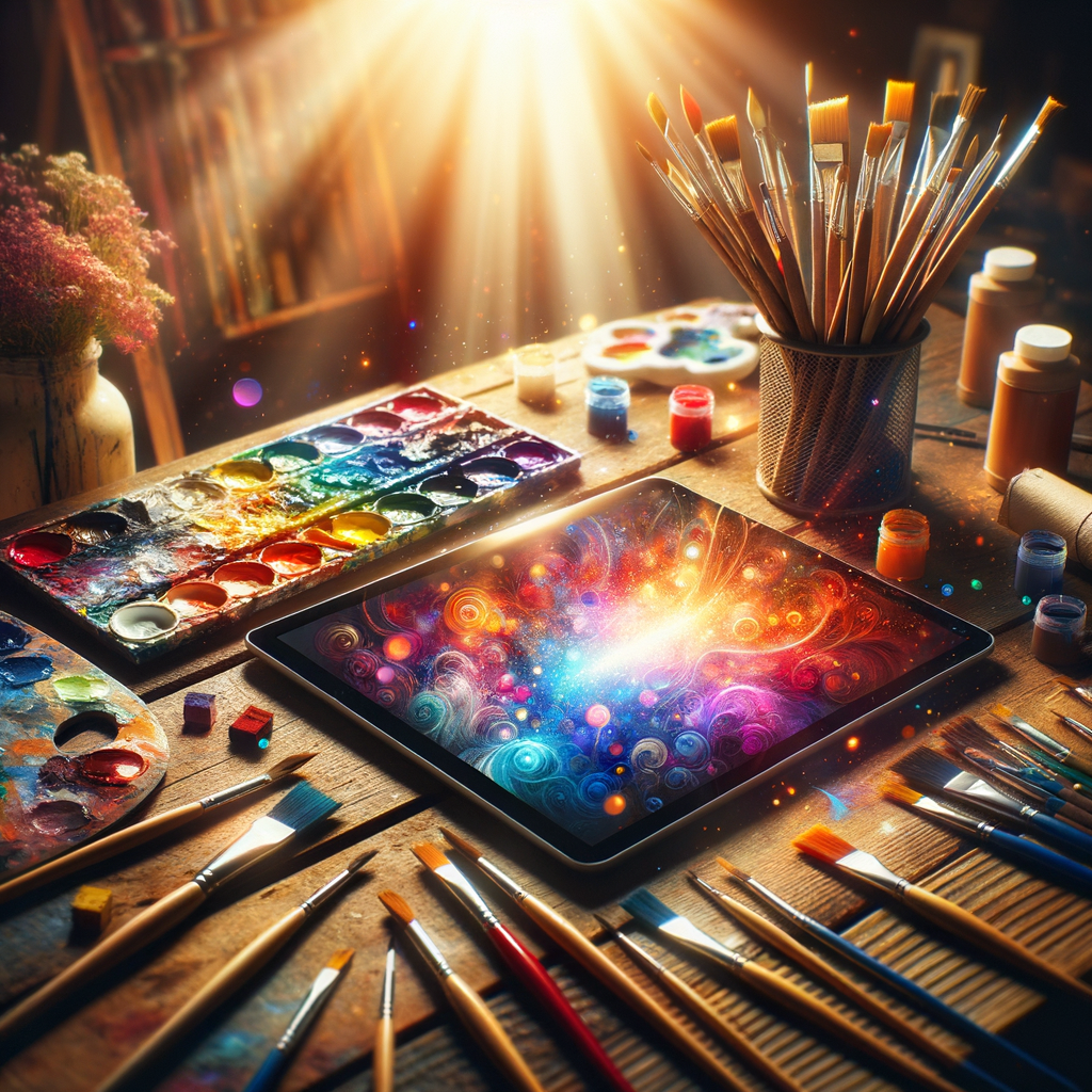
Color is one of the most powerful tools in an artist's arsenal. It can evoke emotions, set the mood, and breathe life into your creations. Whether you are a beginner or an experienced digital artist, mastering the art of color selection can transform your artwork significantly. In this article, we will delve into color theory and provide practical tips on how to create the perfect color palette for your projects. Let's embark on this colorful journey together!
Understanding color is crucial for any artist, as it can greatly influence the impact of the artwork. Here, we will discuss essential concepts in color theory, how to use various color models, and practical steps to develop your own color palettes.
1. The Basics of Color Theory
Color theory encompasses a wide range of concepts that help artists understand how colors interact with each other. The primary colors (red, blue, yellow) can be mixed to create secondary colors (green, orange, purple), which can further combine to form tertiary colors.
Knowing how to utilize complementary colors, analogous colors, and triadic color schemes can add depth and interest to your artwork:
- Complementary Colors: Colors that are opposite each other on the color wheel (e.g., red and green). Using these together can create a high-contrast, vibrant look.
- Analogous Colors: Colors that are next to each other on the color wheel (e.g., blue, teal, and green). These combinations are harmonious and soothing.
- Triadic Colors: A set of three colors that are evenly spaced on the color wheel (e.g., red, yellow, and blue). This scheme offers a vibrant balance.
2. The Color Wheel and Its Importance
The color wheel is a visual representation of colors arranged in a circle. It serves as an essential tool for artists to understand relationships between colors. When working digitally, you can easily access color wheels in most graphic software, helping you visualize the interactions between colors.
3. Choosing the Right Color Palette
When developing a color palette, consider the emotions and themes you want to convey. Here are some steps to guide you:
- Define Your Artwork's Mood: Are you aiming for something cheerful, somber, or mysterious? Define the emotional direction of your piece.
- Start with a Dominant Color: Choose one color that will dominate your artwork. This will serve as the foundation for the rest of your palette.
- Select Supporting Colors: Pick a few colors that complement your dominant color. Ideally, these should include one or two lighter and darker shades to add depth.
- Test Your Palette: Use tools available in digital art programs to create mock-ups of your palette in different scenarios. This helps visualize how your colors interact.
4. Tools for Developing Color Palettes
There are several tools online that can assist you in creating and testing your color palettes:
- Adobe Color: A web-based tool that allows you to create color schemes and explore other user-generated palettes.
- Coolors: A fast color scheme generator that can produce harmonious color palettes with just a click.
- Color Hunt: A curated collection of beautiful color palettes from around the web. Perfect for inspiration!
5. Color Mixing Techniques
To create a unique color palette, blending colors is essential. Here are some mixing techniques to consider:
- Layering: In digital art, layering colors can create beautiful gradients and depth. Experiment with different opacities and blending modes.
- Complementary Mixing: When mixing colors, consider how complementary shades can enhance each other.
- Experimentation: Don’t hesitate to break traditional color rules. Experimenting can lead to surprising and innovative palettes.
6. Cultural Significance of Colors
Colors carry different meanings across cultures. Understanding the local contexts can add another layer of depth to your artwork:
- Red: Often associated with passion or danger, but can also symbolize good fortune.
- Blue: Commonly signifies trust and calmness, but can represent sadness in certain contexts.
- Green: Represents nature and tranquility, but can also signify jealousy.
7. The Role of Light on Color Perception
Light can dramatically alter how we perceive color. Understanding how light interacts with your colors can help you create artworks that feel more vibrant and alive. Experiment with different lighting conditions and observe how they affect your color choices.
8. Practice Makes Perfect
As with any artistic skill, practice is key to mastering color palettes. Make a habit of creating different palettes regularly and applying them to your artworks. Analyze successful pieces by other artists to see how they have utilized color effectively.
Conclusion
Mastering color selection is an essential step on your journey to becoming a skilled artist. By understanding color theory, choosing the right palette, and experimenting continuously, you will be able to create stunning artworks that capture emotion and engage viewers. Remember to have fun with the colors you choose, and let your creativity shine through!
Let the world of color inspire your next masterpiece. Happy painting!

