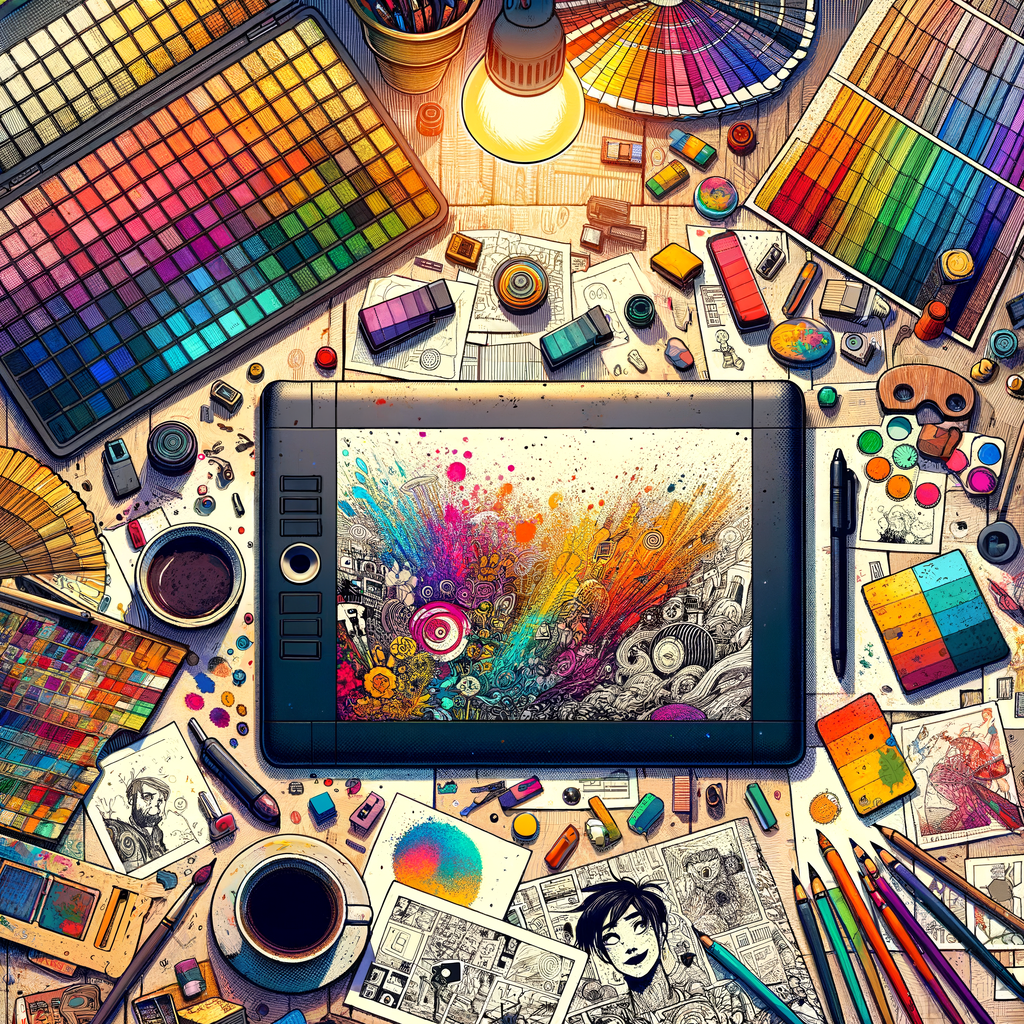
Color plays a vital role in digital art, influencing the mood and effectiveness of a piece. Whether you are a beginner or a professional, understanding how to effectively choose and utilize color palettes can significantly enhance your artistic skills. In this guide, we will explore essential aspects of color theory, provide practical tips for selecting the right palettes, and suggest ways to create dynamic, engaging artworks that resonate with viewers.
Understanding color is one of the most fundamental aspects of digital art. Color theory forms the basis of our ability to create emotions, portray depth, and stimulate the senses through our creations. In this guide, we'll delve into the essentials of color, including the color wheel, the meaning of colors, and how to apply this knowledge to your artwork.
The color wheel is a simple representation of colors arranged in a circle, which helps us understand the relationship between different hues. It is essential for artists to refer to this tool when selecting their palettes. The wheel includes primary colors (red, blue, yellow), secondary colors (green, orange, purple), and tertiary colors, which are formed by mixing a primary color with a secondary color.
Each color carries a certain psychological weight and influence. For example:
- Red: Passion, energy, and urgency.
- Blue: Trust, calmness, and serenity.
- Yellow: Happiness, warmth, and optimism.
- Green: Nature, growth, and harmony.
- Purple: Creativity, luxury, and spirituality.
Understanding these psychological meanings can help you select a palette that evokes the desired emotional response from your audience. When creating a color palette for your artwork, consider the feeling or theme you wish to convey. This is where color theory becomes particularly valuable.
One popular method for creating harmonious color palettes is the use of monochromatic, analogous, or complementary color schemes:
- Monochromatic: Uses variations in lightness and saturation of a single color. This can create a cohesive look but challenges artists to explore the full range of a single hue.
- Analogous: Combines colors that are next to each other on the color wheel, creating a harmonious effect. This type of palette enhances the theme without overwhelming the viewer.
- Complementary: Utilizes colors that are opposite each other on the color wheel, providing high contrast and vibrant visuals. This technique can create excitement and draw attention to focal points.
Beyond selecting colors, you should also consider the context of their use. Different cultures and traditions assign distinct meanings to specific colors, and it is essential to be aware of these differences, especially if your audience is diverse.
When artists begin working digitally, it is crucial to experiment with different palettes and approaches. Don’t be afraid to test the boundaries; consider crafting a palette inspired by an existing artwork, nature, or emotions you want to convey.
Additionally, tools like Adobe Color and Coolors can be invaluable resources for generating and saving color palettes. These applications allow you to visualize various palettes and explore complementary and analogous color ranges at the click of a button.
As you advance in your digital artistic journey, syncing your brushwork with your color choices is vital. This involves not only selecting the right colors but also mastering blending techniques to help colors flow seamlessly together on your digital canvas. Techniques such as layer blending modes in Photoshop or Procreate help achieve depth and dimension.
Remember, color usage in digital art can transform the viewer's experience from purely visual to deeply emotional. Employ the principles from our exploration, experiment passionately, and continue to grow as an artist.
Ultimately, developing your personal style through color is key. Each artist's relationship with their chosen colors is unique, and as you work on your craft, you will discover what resonates with you. Allow your artistic expression to flourish through the power of color, enabling you to create works that not only attract but also invoke emotion and connection.
In concluding this extensive exploration of how to master color in your digital artworks, it's essential to remember that the adventure doesn’t end here. Keep experimenting, studying, and evolving your practice, and allow color to guide your journey toward becoming a more effective storyteller through your art.

