
Color is one of the most powerful tools in an artist's arsenal. It has the ability to convey emotion, set the mood, and draw attention to specific areas of an artwork. For aspiring artists and seasoned professionals alike, understanding color theory and how to effectively choose a color palette is essential for creating stunning compositions. In this article, we'll delve into the fundamentals of color theory, explore the science behind color mixing, and provide practical advice on how to select palettes that will elevate your digital art to new heights. Whether you are painting a whimsical landscape or a realistic portrait, mastering these concepts can significantly impact the final outcome of your work.
Color theory is a vast and intricate subject, encompassing not just the basic color wheel but also the relationships between colors, the psychological effects they have, and the techniques for mixing and applying them. Let's start with the basics.
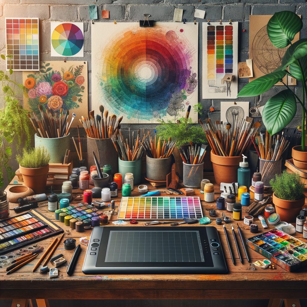
Understanding the Color Wheel
The color wheel is a visual representation of colors arranged according to their chromatic relationship. Primary colors – red, blue, and yellow – are the foundation of the color wheel. From these, you can create secondary colors (green, orange, and purple) by mixing two primary colors. Tertiary colors, which include combinations like red-orange and blue-green, complete the wheel.
This wheel helps artists understand the relationships between colors. For instance, complementary colors (those opposite each other on the wheel) create strong contrasts when placed next to each other, enhancing vibrancy. On the other hand, analogous colors (those next to each other) yield a more harmonious feel.
The Psychological Influence of Color
Colors evoke emotions and can influence the viewer's perception of your artwork.
- Red is often associated with passion, anger, or love.
- Blue conveys calmness, sadness, or stability.
- Yellow evokes feelings of happiness and energy.
Being aware of these associations can help you choose colors that resonate with the emotions you wish to convey in your piece. Consider how the colors you select will affect the story told by your artwork.
Color Harmony and Contrast
Harmony in art refers to the pleasing arrangement of colors. To achieve harmony, you must consider a few aspects:
- Monochromatic schemes: Using variations in lightness and saturation of a single color can create a soft, cohesive look.
- Complementary schemes: As mentioned, pairing colors opposite each other on the color wheel can create a vibrant contrast, drawing attention to specific areas.
- Triadic schemes: Using three equally spaced colors on the color wheel provides a fun and varied palette.
Experimenting with different harmonies allows you to discover unique combinations that suit your artistic style.
Practical Tips for Palette Selection
Now that you've grasped the fundamentals, here are some practical tips for choosing the perfect color palette:
- Start with Inspiration: Gather images, artworks, and nature scenes that inspire you. Extract the dominant colors and create a palette from them.
- Limit Your Colors: When beginning a new piece, limit yourself to a few colors initially. This helps in focusing on color relationships and maintaining harmony.
- Use Color Tools: Utilize digital tools like Adobe Color or Coolors that help in generating and saving color palettes.
Practice Makes Perfect
The more you work with color, the better you'll understand its nuances. Create small studies focused solely on color without the pressure of a final piece. This practice will enhance your skills and boost your confidence in selecting and mixing colors.
Conclusion
Mastering color theory and palette selection takes time and practice but is tremendously rewarding. Understanding color relationships, the psychological impact of colors, and practical approaches to palette selection can vastly enhance your artistry. Keep experimenting, seek inspiration, and remember to trust your instincts.
By incorporating these principles into your work, you will not only create more visually appealing pieces but also connect more deeply with your audience through the story your colors tell. Happy painting!