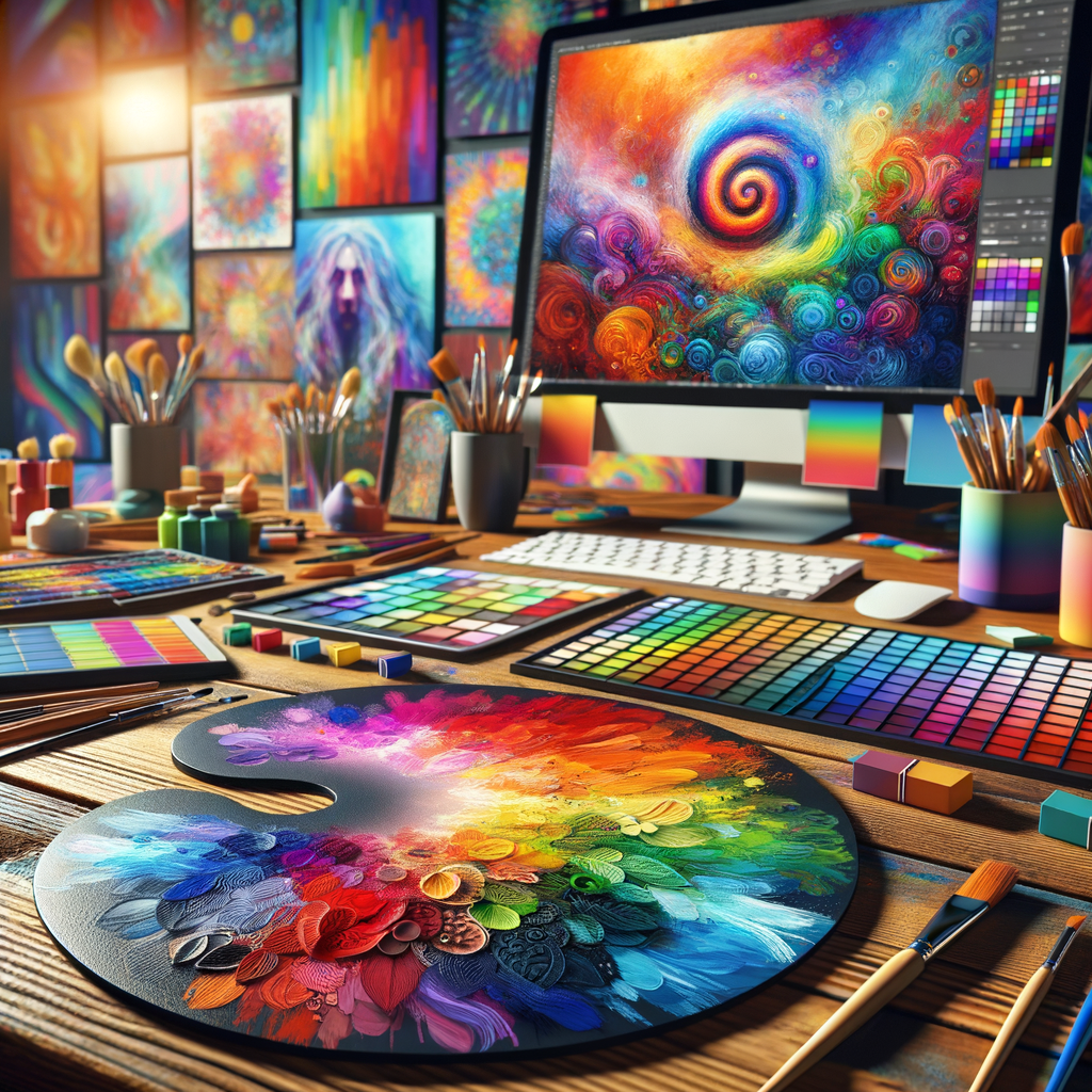
Color theory is a fundamental aspect of art that significantly impacts the way we perceive and interact with our creations. Understanding how colors work together can enhance your artwork dramatically, leading to more emotional and visually appealing pieces. This comprehensive guide is designed to help digital artists, from beginners to professionals, grasp the intricacies of color theory and apply it in their digital paintings. Whether you're looking to create stunning landscapes, dynamic character designs, or captivating abstract artwork, mastering the art of color can elevate your creative projects to new heights.
Color is more than just a visual experience; it evokes emotions and can influence mood, atmosphere, and storytelling in art. As a digital artist, having a solid understanding of color theory is essential. In this guide, we will cover various aspects of color theory, including the color wheel, color harmonies, psychological effects of color, and tips for creating effective color palettes.
The Color Wheel
The color wheel is a circular diagram that represents the relationships between colors. It was developed by Sir Isaac Newton in the 17th century and has become a pivotal tool in the study of color. The wheel consists of primary, secondary, and tertiary colors.
Here’s a breakdown:
- Primary Colors: Red, Blue, Yellow. These are the colors that cannot be created by mixing other colors.
- Secondary Colors: Green, Orange, Purple. These are formed by mixing two primary colors.
- Tertiary Colors: These are created by mixing a primary color with a secondary color.
Understanding these relationships is the first step in mastering color theory.
Color Harmonies
Color harmonies refer to the pleasing combinations of colors that create a sense of balance and visual appeal in your artwork. Here are the most common types of color harmonies:
- Complementary: Colors that are opposite each other on the color wheel (e.g., red and green). Using complementary colors can create vibrant contrasts in your work.
- Analogous: Colors that are next to each other on the color wheel (e.g., blue, blue-green, and green). These colors usually match well and create serene designs.
- Triadic: Three colors that are evenly spaced across the wheel (e.g., red, yellow, blue). This harmony can provide a vibrant and rich color scheme.
- Split-Complementary: Taking a base color and using the two colors adjacent to its complementary color. This combination offers high contrast while retaining harmony.
- Tetradic: Four colors that form a rectangle on the color wheel. This scheme features two complementary color pairs, creating a rich color scheme.
Determining which harmony to use can depend on the mood you wish to convey or the message you want to express in your artwork.
The Psychological Effects of Color
Colors can influence emotions and perceptions. Understanding the psychological effects of colors can help you make more intentional choices in your artwork:
- Red: Often associated with energy, passion, and danger.
- Blue: Conveys calmness, trust, and stability.
- Yellow: Typically evokes happiness, warmth, and optimism.
- Green: Represents nature, growth, and tranquility.
- Purple: Associated with creativity, luxury, and spirituality.
- Black: Can signify elegance, mystery, or sometimes fear.
- White: Often symbolizes purity, simplicity, and peace.
Using colors intentionally based on their psychological significance can enhance the narrative of your artwork.
Creating Effective Color Palettes
One of the challenges digital artists face is creating color palettes that successfully convey their intended mood and atmosphere. Here are some tips:
- Start with a Base Color: Choose a color that embodies the emotion or theme you want to represent. This will serve as your foundation.
- Limit Your Palette: Using too many colors can overwhelm the viewer. Stick to a color palette of 3-5 colors that work well together.
- Use Online Tools: Utilize color palette generators and design tools such as Adobe Color or Coolors to experiment with different combinations and find inspiration.
- Observe Nature: Nature is a fantastic source of color inspiration. Pay attention to how colors interact in landscapes and environments around you.
- Test and Adjust: Don’t hesitate to try different combinations and seek feedback from peers or within art communities to refine your palette.
Conclusion
Mastering color theory is a continuous journey that requires practice and exploration. As you incorporate these principles into your digital artwork, remember that experimentation is key. Allow yourself the freedom to play with colors and discover what works best for your style and narrative. With time, you will create artwork that not only captivates the eye but also resonates emotionally with your audience. Happy painting!

