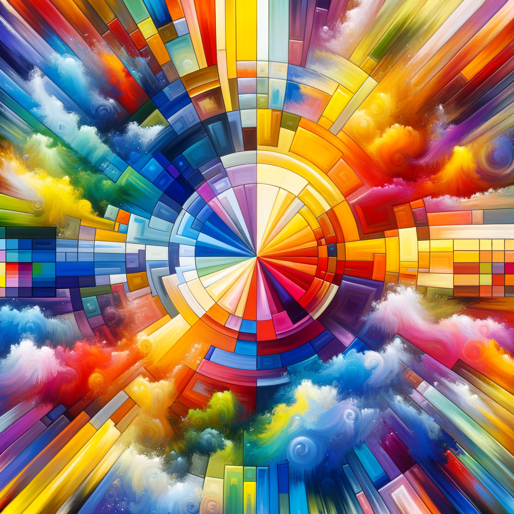
Color is one of the most essential elements in creating art, particularly in digital painting. Understanding color theory can elevate your work, enabling you to manipulate color to evoke emotions and convey messages effectively. In this article, we will delve deep into the principles of color theory, practical applications for digital artists, and how to select and combine colors to enhance your creations. Whether you are a beginner or a seasoned artist, this guide will provide valuable insights into mastering the art of color.
Color theory is a complex yet fascinating subject that encompasses the study of color in relation to art and design. At its core, color theory revolves around the color wheel, which organizes colors in a way that demonstrates their relationships to one another. Understanding these relationships allows artists to create more dynamic and visually appealing artwork.
The color wheel primarily consists of three categories: primary, secondary, and tertiary colors. Primary colors (red, blue, yellow) cannot be created by mixing other colors. Secondary colors (green, orange, purple) are formed by mixing two primary colors. Tertiary colors are the result of mixing a primary color with a secondary color, leading to a rich spectrum of hues.
One of the first steps in mastering color theory is familiarizing yourself with color harmony, which refers to the pleasing arrangement of colors in artwork. There are several types of color harmony you can explore:
- Complementary Colors: These are colors that are opposite each other on the color wheel. Using complementary colors can create a striking visual contrast that captures the viewer's attention.
- Analogous Colors: These colors are next to each other on the color wheel. Creating compositions with analogous colors can produce a serene and harmonious effect.
- Triadic Colors: This scheme involves three colors that are evenly spaced on the color wheel. It can offer vibrant and lively artwork, maintaining balance throughout the composition.
In addition to color harmony, understanding temperature is crucial for a successful color palette. Colors can be classified as warm (reds, oranges, yellows) or cool (blues, greens, purples). Warm colors tend to evoke energy and excitement, while cool colors convey calmness and tranquility. Skillfully combining warm and cool colors can help you establish a mood within your artwork.
When creating a color palette, it’s essential to consider the emotions and themes you wish to convey. Artists often create color palettes based on content; for example, if you’re illustrating a scene in nature, you might opt for greens and browns, while a vibrant cityscape might inspire bright, bold colors. Taking advantage of the emotional impact of colors helps you engage your audience more deeply.
To experiment with color, you could use tools such as Adobe Color Wheel or Coolors.co, which allow you to generate and save color palettes based on various color schemes. These tools can simplify the process of finding harmonious color combinations, allowing you to focus on creating stunning artwork.
Another practical application of color theory is understanding the RGB and CMYK color models. In digital art, colors are often represented through the RGB (Red, Green, Blue) model, which deals with light and is extensively used in screens and digital displays. On the other hand, CMYK (Cyan, Magenta, Yellow, Key/Black) is more relevant when dealing with printing, as it utilizes pigments. Grasping these color models is vital for ensuring that your colors appear as intended in both digital and physical formats.
Furthermore, the process of mixing colors involves two crucial concepts: additive and subtractive color mixing. Additive mixing occurs when light is combined to create new colors, while subtractive mixing applies to pigments. Understanding these methods can further enhance your ability to reproduce colors accurately in your digital artwork.
As you grow more comfortable with color theory, continuously challenge yourself to integrate new color combinations and techniques into your work. Engage in exercises that involve creating artwork solely based on specific color schemes or palettes. Over time, you will develop a unique style that reflects your artistic voice and paint with intention.
In summary, mastering color theory is an invaluable skill for digital artists. By understanding color relations, applying color harmony, and exploring color temperatures, you can create compelling artwork that resonates with your audience. As you practice and experiment, your ability to use color effectively will improve, transforming your digital art practice.
Embrace the beauty and complexity of color, and let it guide your artistic journey!

